Colors in Urban Design Presentation
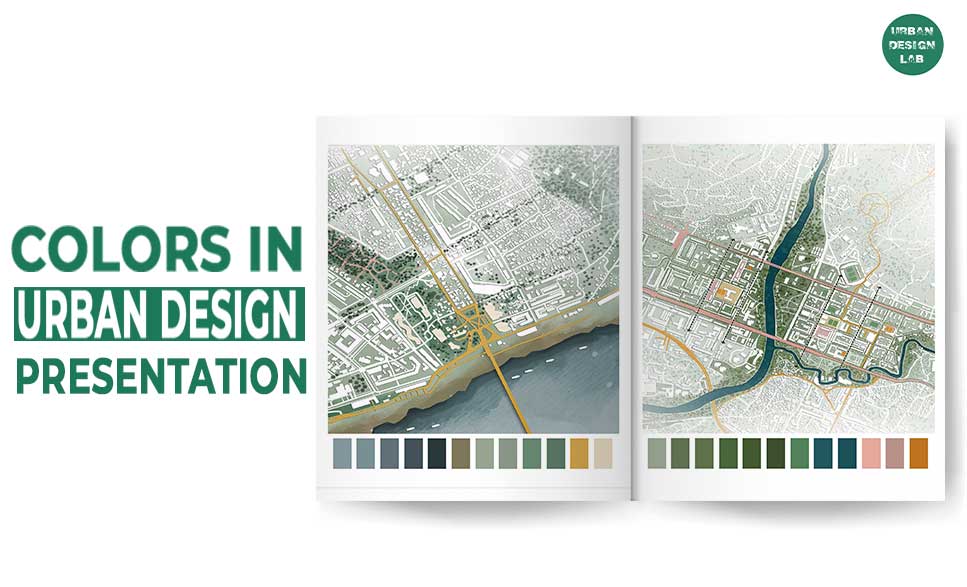
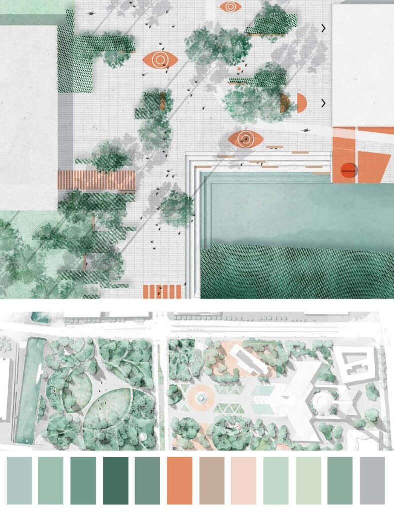
The presentation style of any project is crucial for effective project transfer. Colors play a vital role in urban design presentations, in addition to establishing presentation methodologies. One of the most crucial aspects of presenting architecture is its colour scheme, which we shall discuss in this post.
Types of color schemes
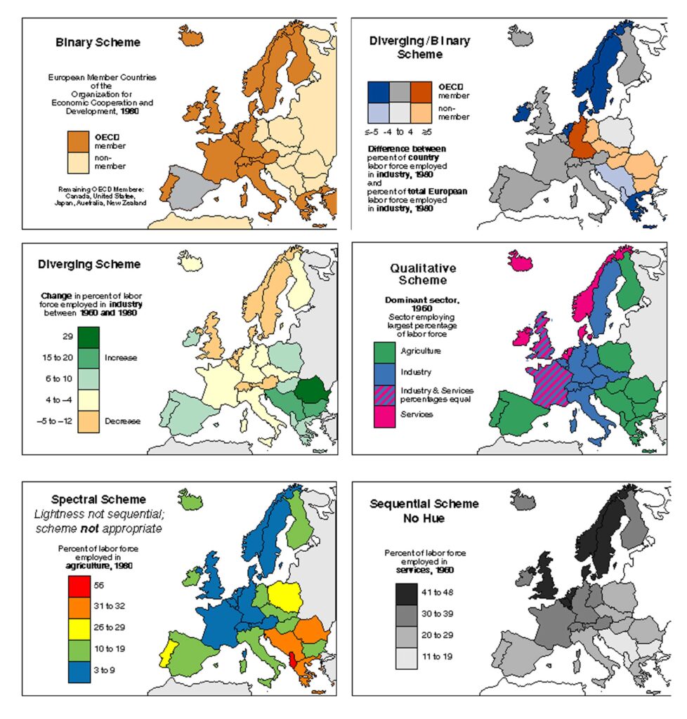
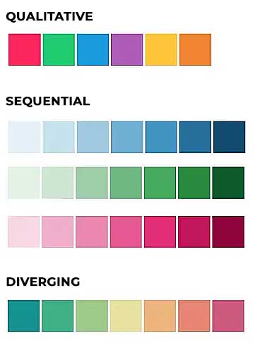
There are three main types of color schemes applied to maps: Qualitative, Sequential and Diverging. Variation in all three perceptual dimensions of color – Hue, Saturation and Lightness – are applied to show differences in the data. The basic principle is that variations in hue visualize nominal/categorical differences while variations in lightness visualize ordinal differences. But the strict application of this rule varies from one case to another: qualitative schemes may apply plenty of variations in lightness, especially when there is a large number of categories to display and sequential scales can benefit from hue variations when they are first and foremost ordered by lightness.
Qualitative schemes
Qualitative schemes are applied to discrete unordered classes of nominal data such as race or ethnicity. They are not appropriate for mapping ordered numerical data. The distinction between classes becomes visible through variations in hue, ideally with no or slight lightness differences between colors. If a class needs to be highlighted it is possible to use a darker or more saturated color to visualize it. Qualitative schemes may also consist of paired hues with lighter and darker shades of the same color, applied to related categories (ex: related land use categories such as single and multifamily residential buildings).
Sequential scheme
Sequential schemes are applied to ordered, often numerical data such as floor area ratio per lot or population density per square mile. Changes in color lightness correspond to the progression from low to high: light colors are used for lower values and the dark colors are used for higher values. Sequential schemes can derive from both single and multi-hue combinations. The higher the number of data classes – the more difficult the distinction between each step.
Diverging schemes
Diverging schemes are often described as a combination of two sequential schemes with a critical break point in the middle. The two sequences “diverge” from a shared light color that stresses important mid-ranges in the data. The two extremes are visualized by contrasting dark hues while changes in lightness are used to display intermediate values. Diverging schemes are usually symmetrical but specific data distribution may require shifting the break point towards either one of the extremes. Common examples of data suitable for diverging color scales are temperature variations and stock exchange dynamics.
How Colors Affect Urban Design Presentations
The use of color in maps and data visualizations has a long tradition. Color, along with position, size, shape, value, orientation, and texture is one of the primary means to encode data graphically.
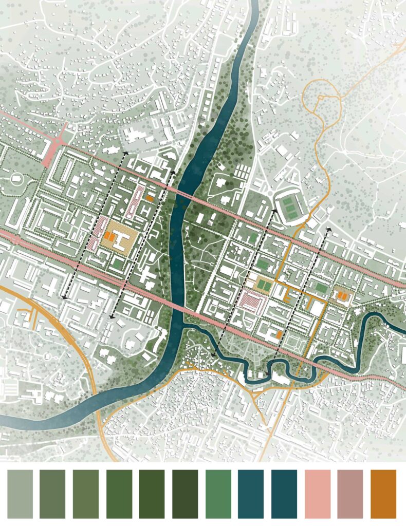
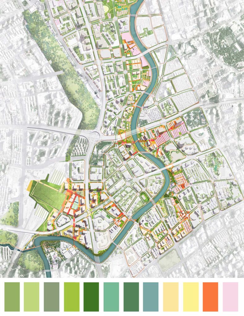
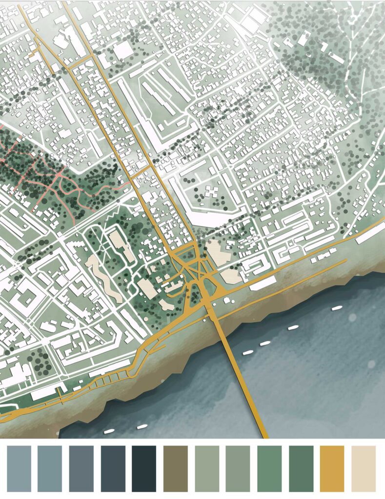
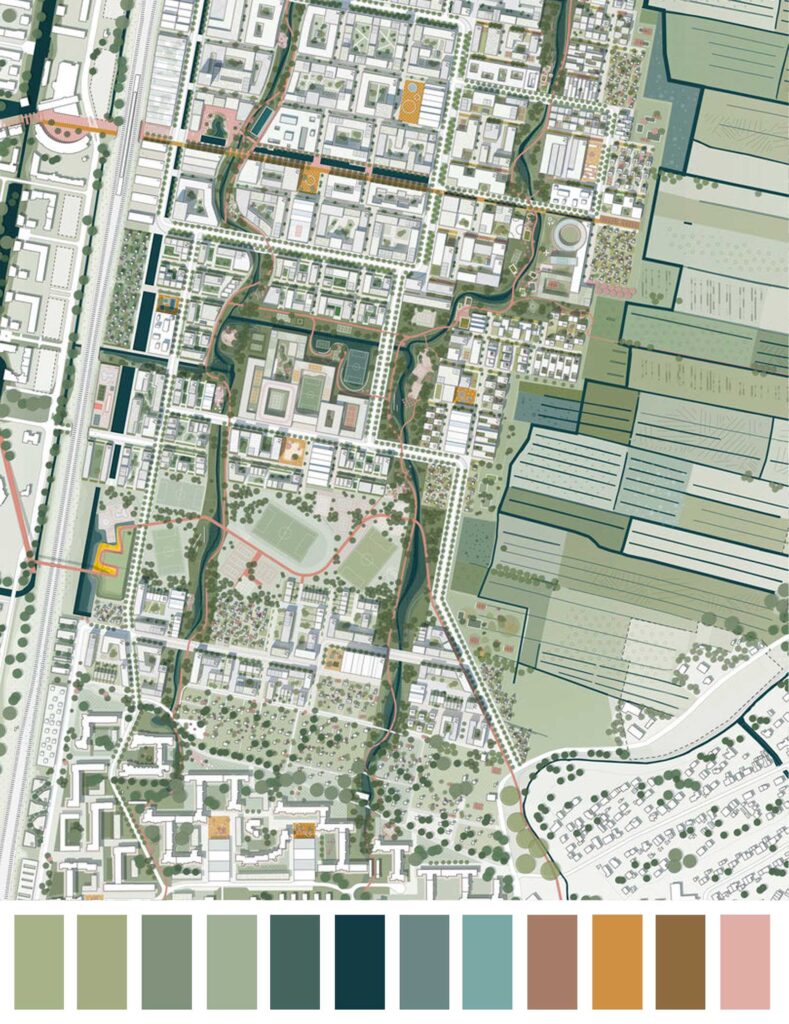
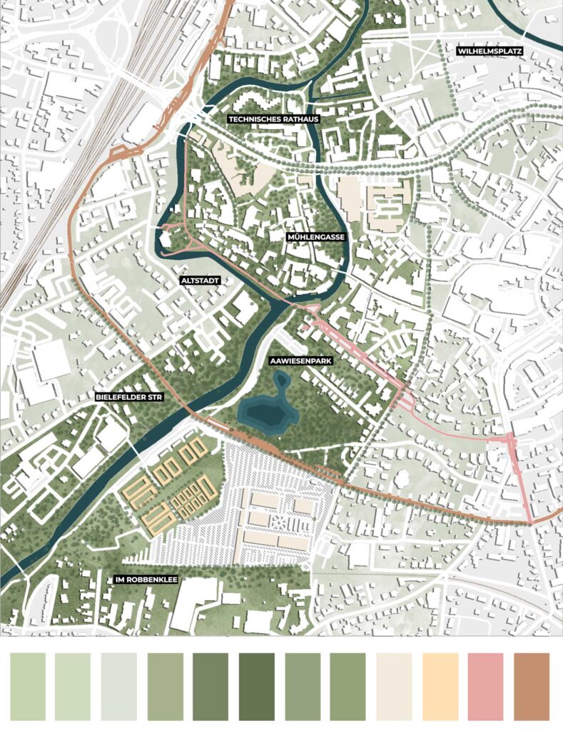
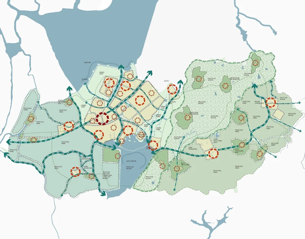
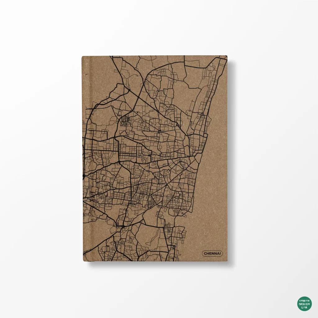
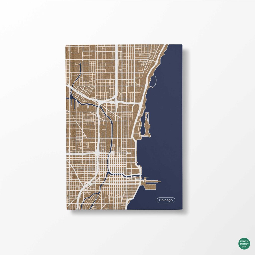
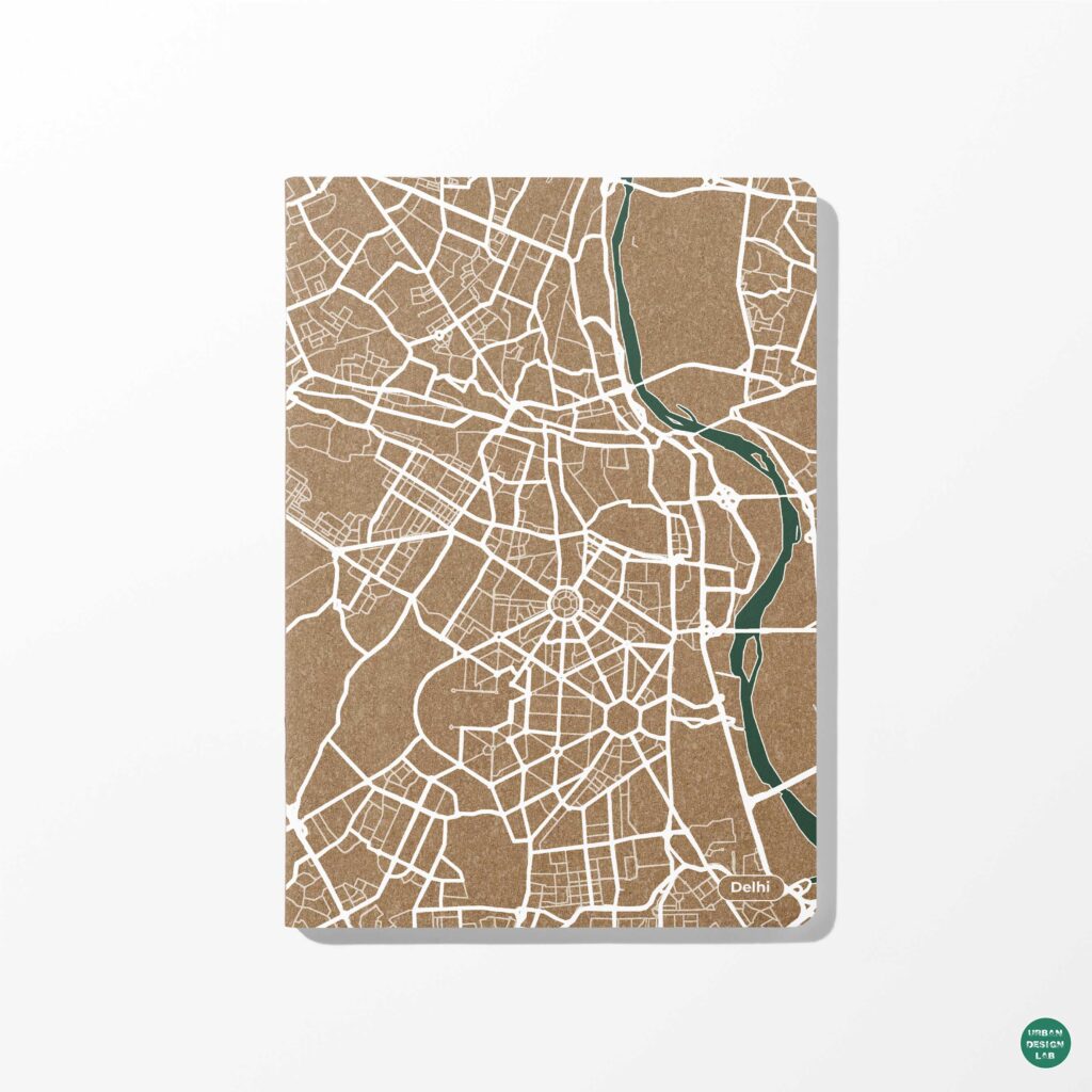
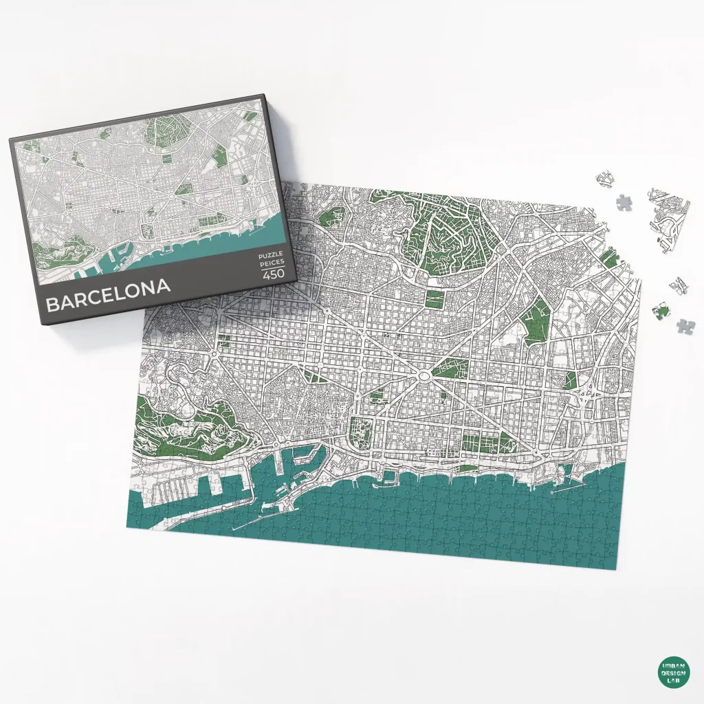
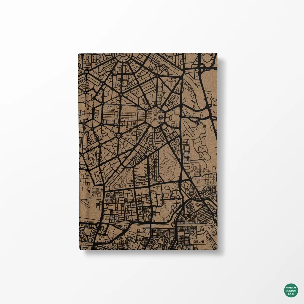
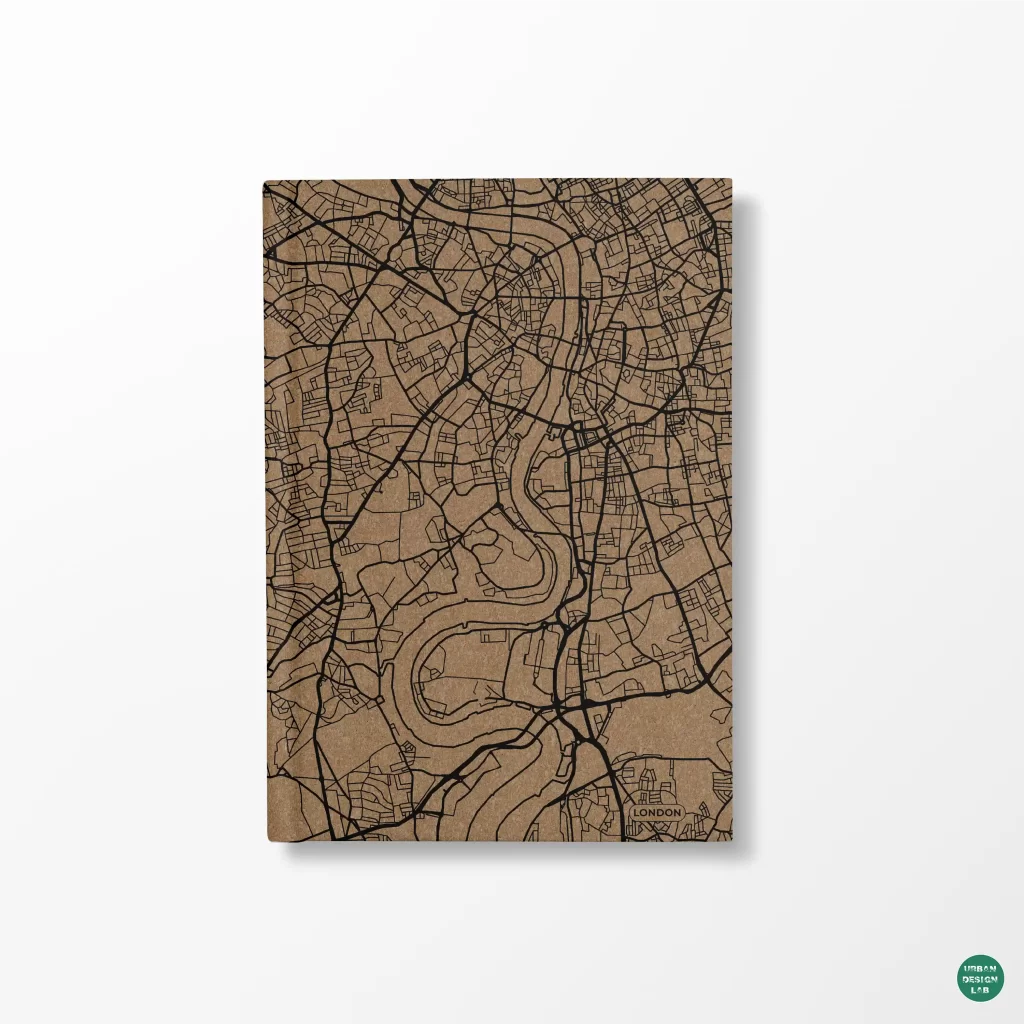
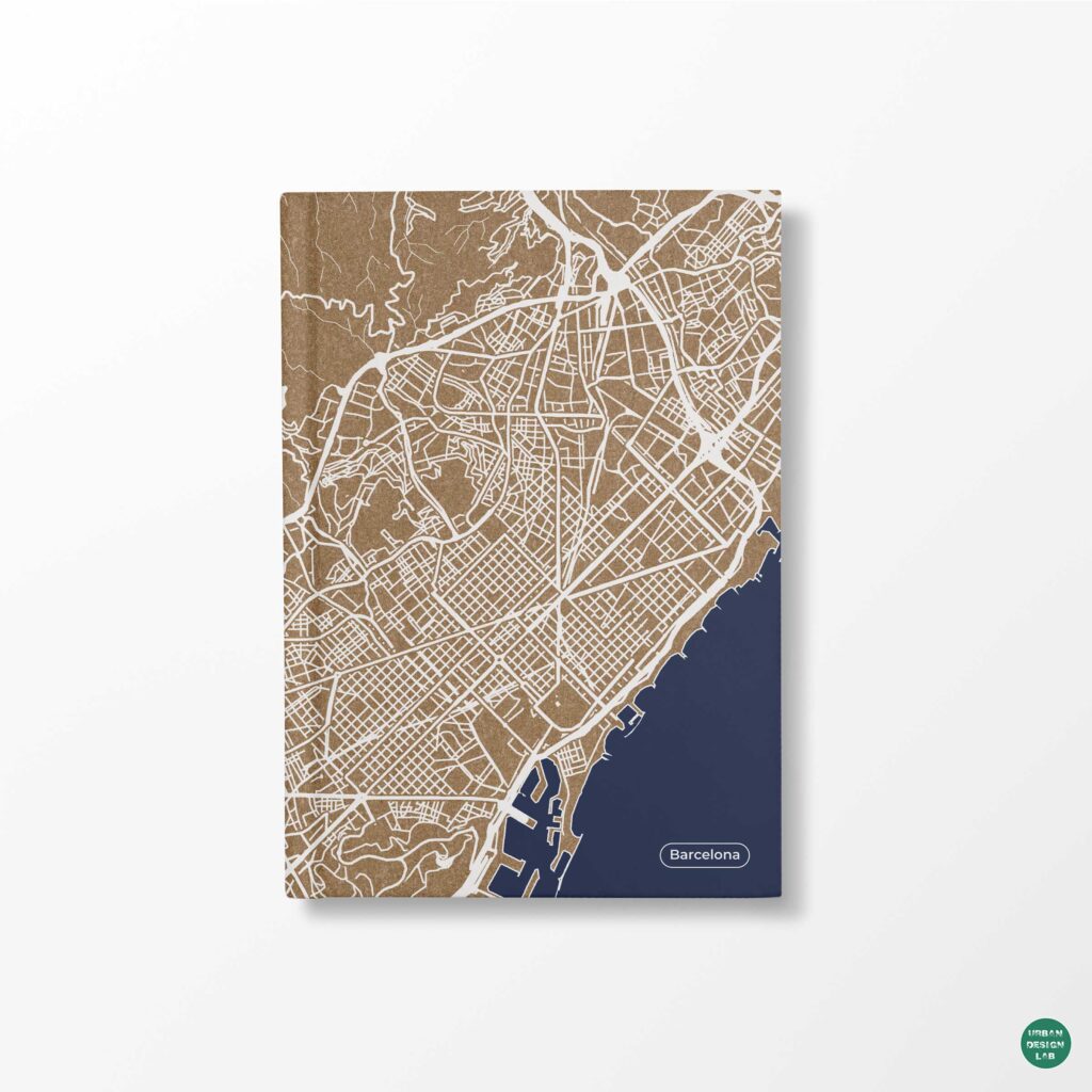
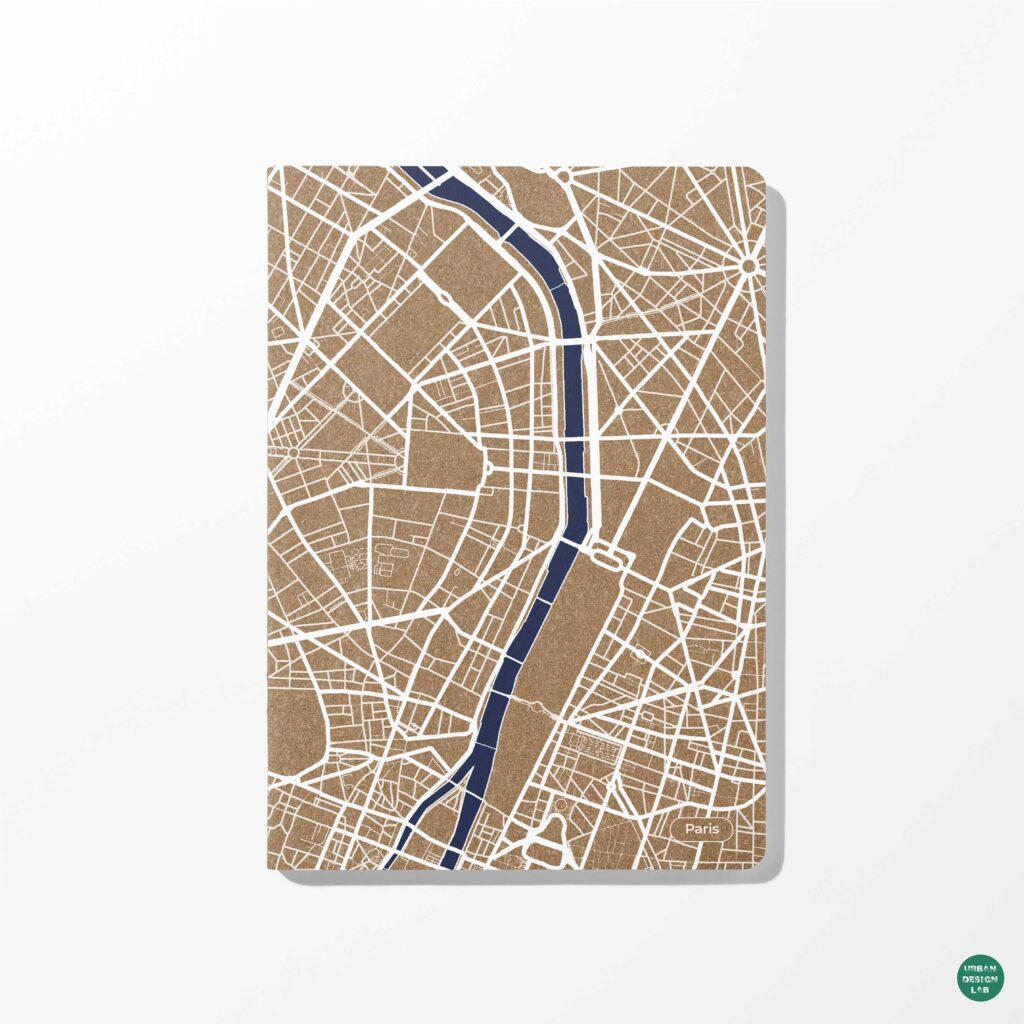
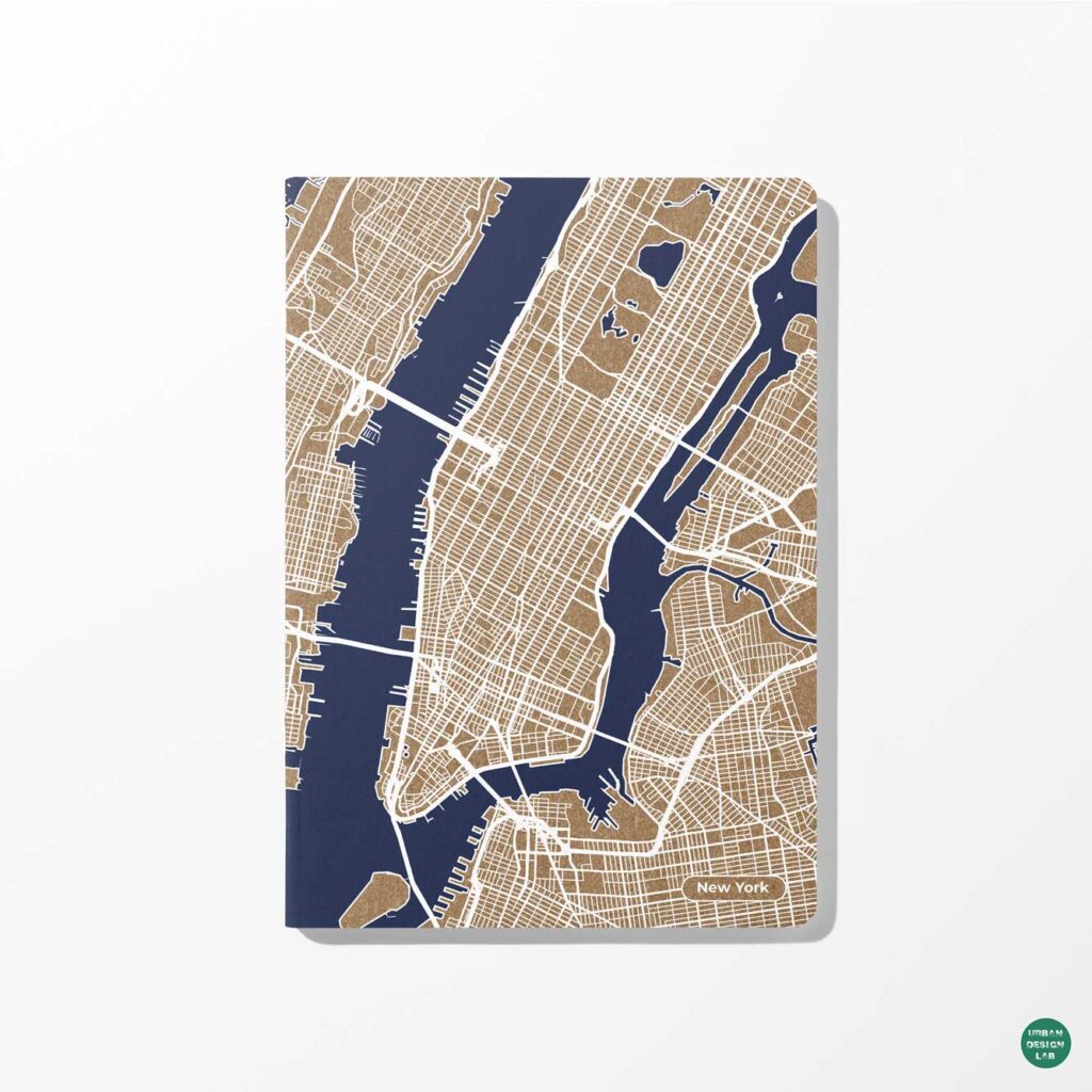
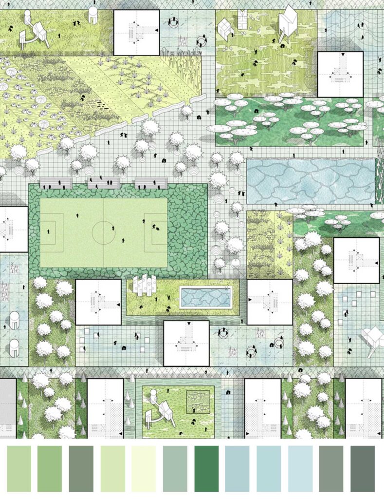
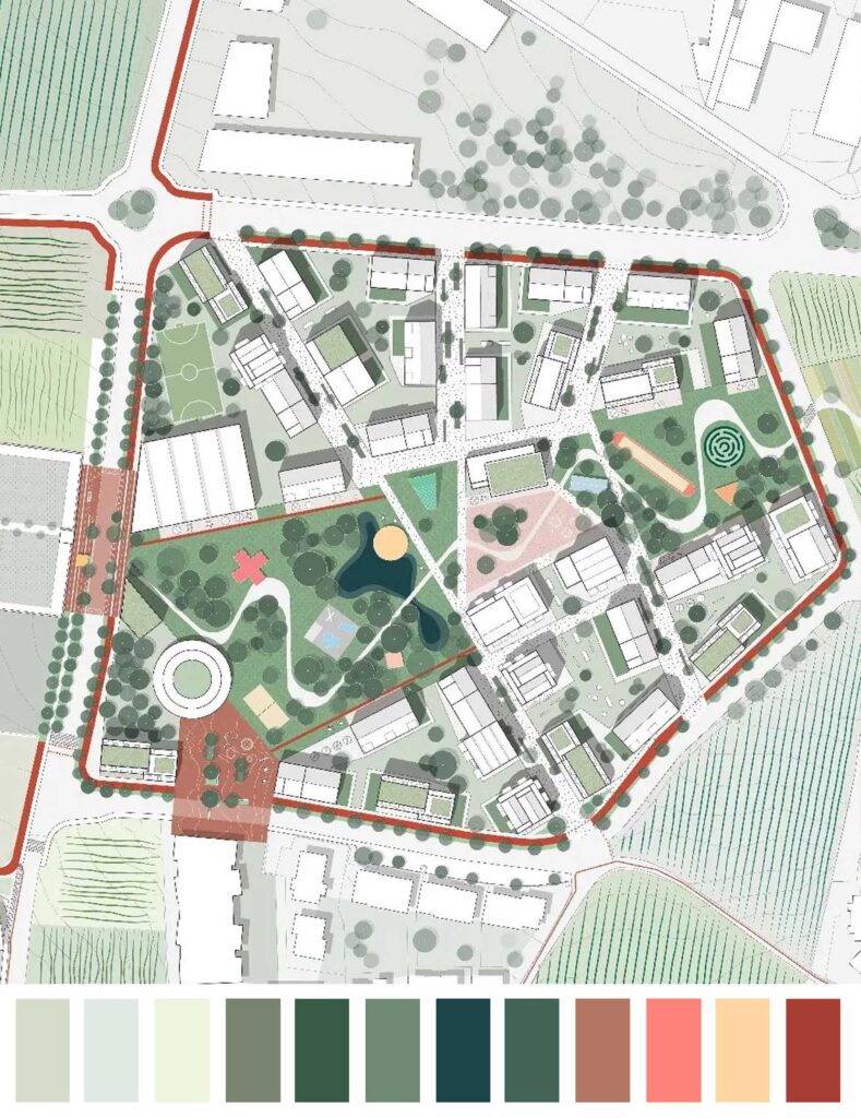
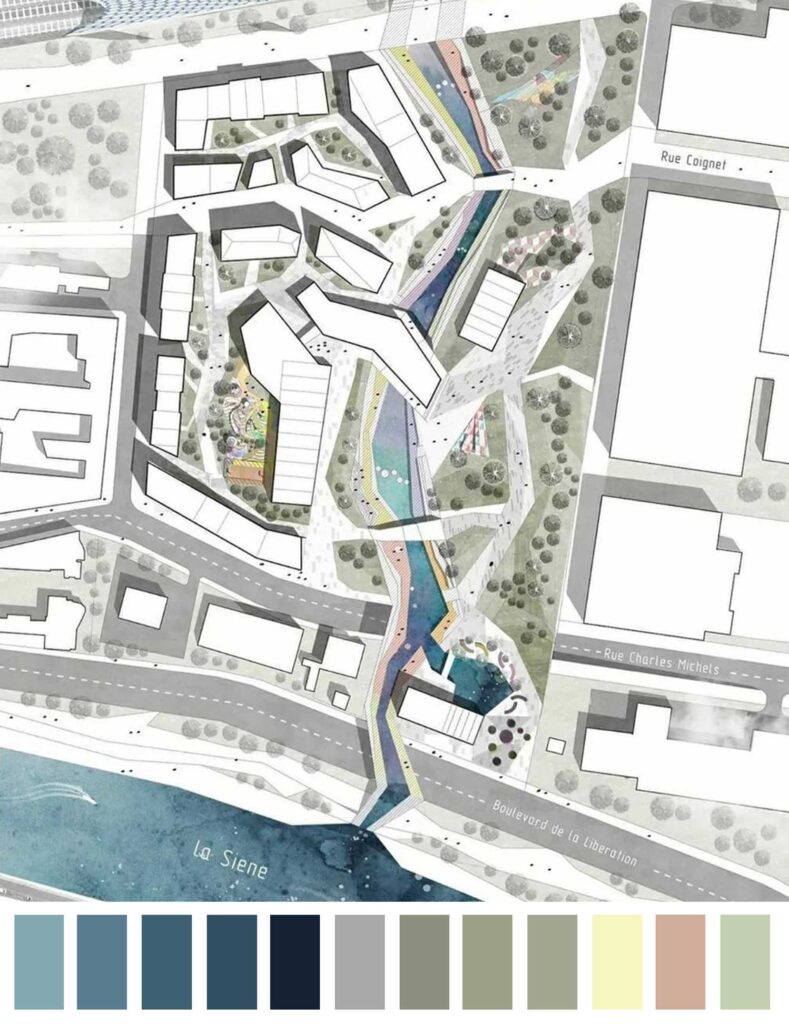
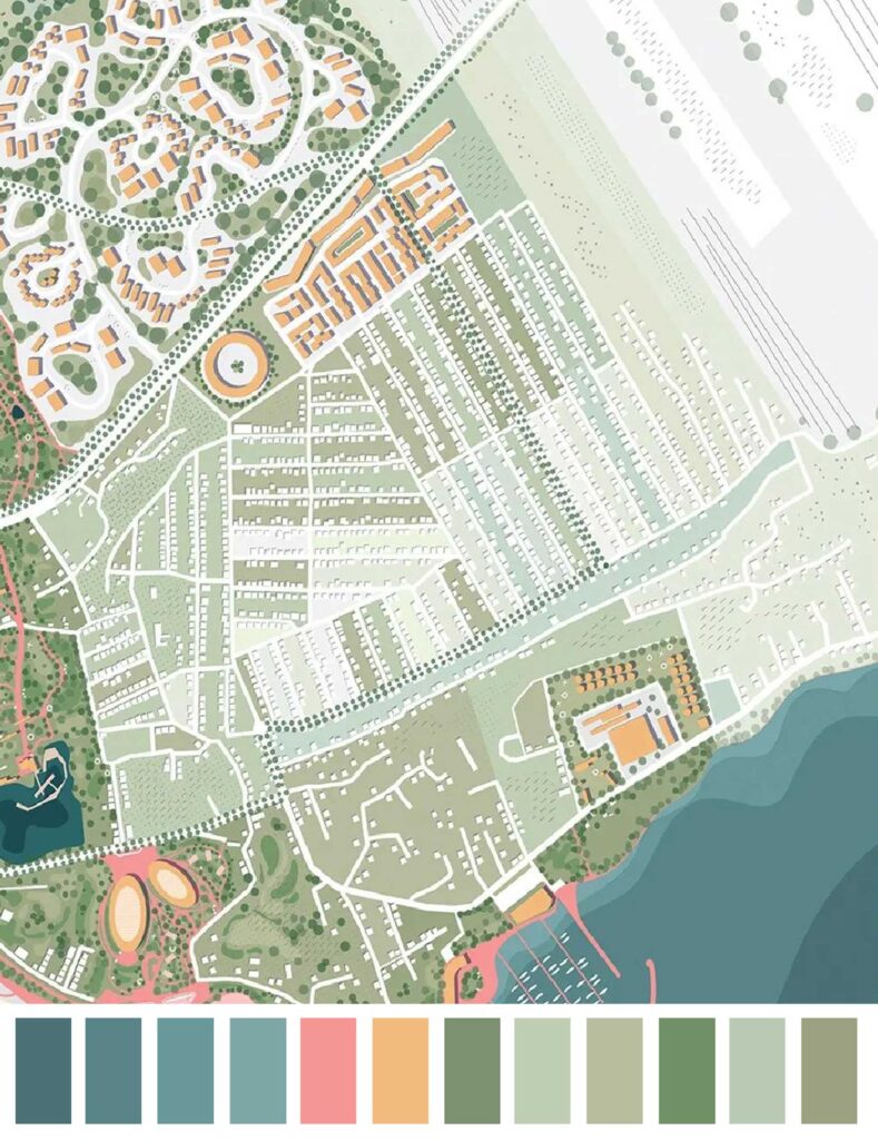
When you are making an urban design presentation, color plays a vital role. It can influence the way your clients view your presentation and how much information they are able to grasp. How different colors interact with one another and how you use them can have a huge impact on the appearance of your presentation. The color schemes of the following master plans can serve as inspiration for your next masterplan.

Urban Design Lab
About the Author
This is the admin account of Urban Design Lab. This account publishes articles written by team members, contributions from guest writers, and other occasional submissions. Please feel free to contact us if you have any questions or comments.
Related articles


Remembering Frank O. Gehry: The Architect Who Redrew Skylines

Architecture Professional Degree Delisting: Explained
Periodic Table for Urban Design and Planning Elements

UDL GIS
Masterclass
GIS Made Easy – Learn to Map, Analyse, and Transform Urban Futures
Session Dates
4th-8th May 2026

Free E-Book
From thesis to Portfolio
A Guide to Convert Academic Work into a Professional Portfolio”

Urban Design Lab
Be the part of our Network
Stay updated on workshops, design tools, and calls for collaboration
Recent Posts
- Article Posted:
- Article Posted:
- Article Posted:
- Article Posted:
- Article Posted:
- Article Posted:
- Article Posted:
- Article Posted:
- Article Posted:
- Article Posted:
- Article Posted:
Sign up for our Newsletter
“Let’s explore the new avenues of Urban environment together “

