
How color affects Architecture and Design
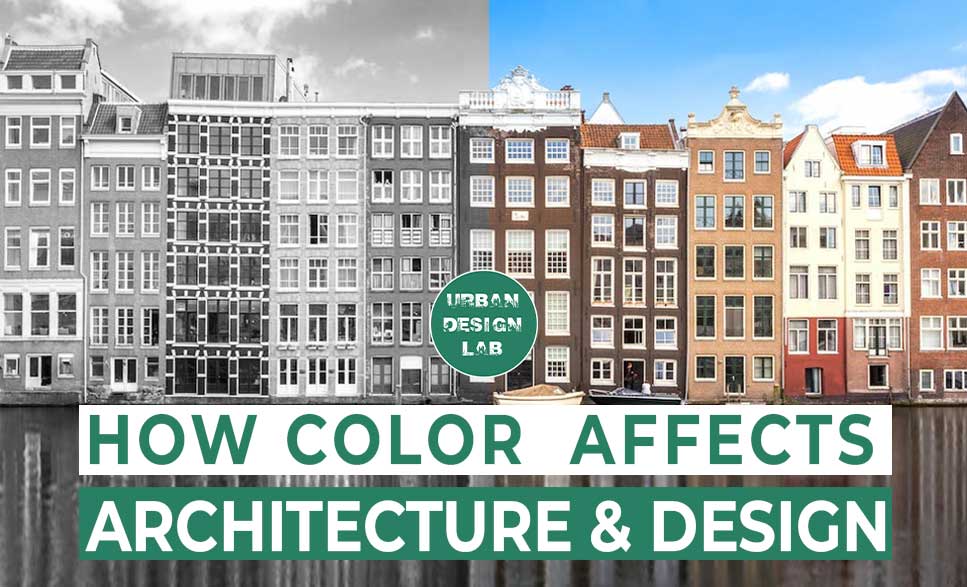
Color and Architecture
When you hear the word color, the first thing that comes to mind is an imaginary rainbow or seven strips of an old television screen. Because of its connotations and the nature of changing senses, it is combined with human psychics. Architecture is a human infrastructure settlement that has been developed over time to divide spaces into liveable designs. Exterior building colors stand for its identity through a positive or negative attitude, while the interior of the building depicts the mood, senses, and space. Color is not just an aesthetic element of a structure but a powerful medium to connect with it. Historically, architects have relied on theories and color balance in lifestyle to attract and achieve healthy goals for environments. The main purpose of architectural design is to keep comfort for the user, and color is the best way to express this.
What is colorimetry?
In architecture, colorimetry is a constitutive element that finishes the reading and the spatial quality. It is therefore an essential player in the general atmosphere. You should know that, instinctively, people analyse all situations and therefore the space around them. Color is perceived long before form. As a result, any tangible space has a direct impact on the unconscious and influences our reactions as well as our feelings.
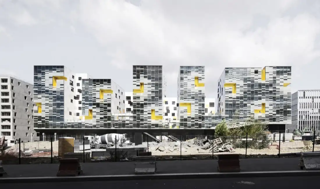
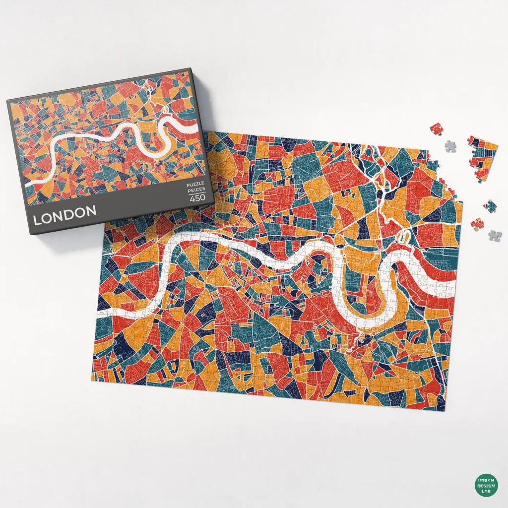
Architects and designers have always preferred colors like whites, grays, and other subtle tones. Now, architects are slowly realizing the effects a bright and colorful building can have on onlookers and the overall feel of a city. The use of colors in buildings has evolved over the years. From the azure streets of Chefchaouen, Morocco, to the ethnically diverse city of Cape Town, South Africa, the unusually bright colors stand out among the more muted colors of the contemporary world. Today, these colorful neighborhoods are some of the most eccentric tourism magnets in the world! In the past decade, some traditionally bleak towns, including London and other European cities, have started using bolder colors on the exterior and interior of homes. While brighter colors can change the appearance of a city significantly, many architects hesitate to get involved in the color evolution. Since colors help develop perspective and deepen a viewer’s understanding of architectural design, they are a wonderful tool that most architects keep in their back pockets. (Source: Strategic use of colors for architecture purposes by Think Architecture)
“It became very important for architecture students to understand not only how space was made in architectural form, but also how it was implied in painting,” by Robert Slutzky in Architecture is Inseparable from Color
Color Theory
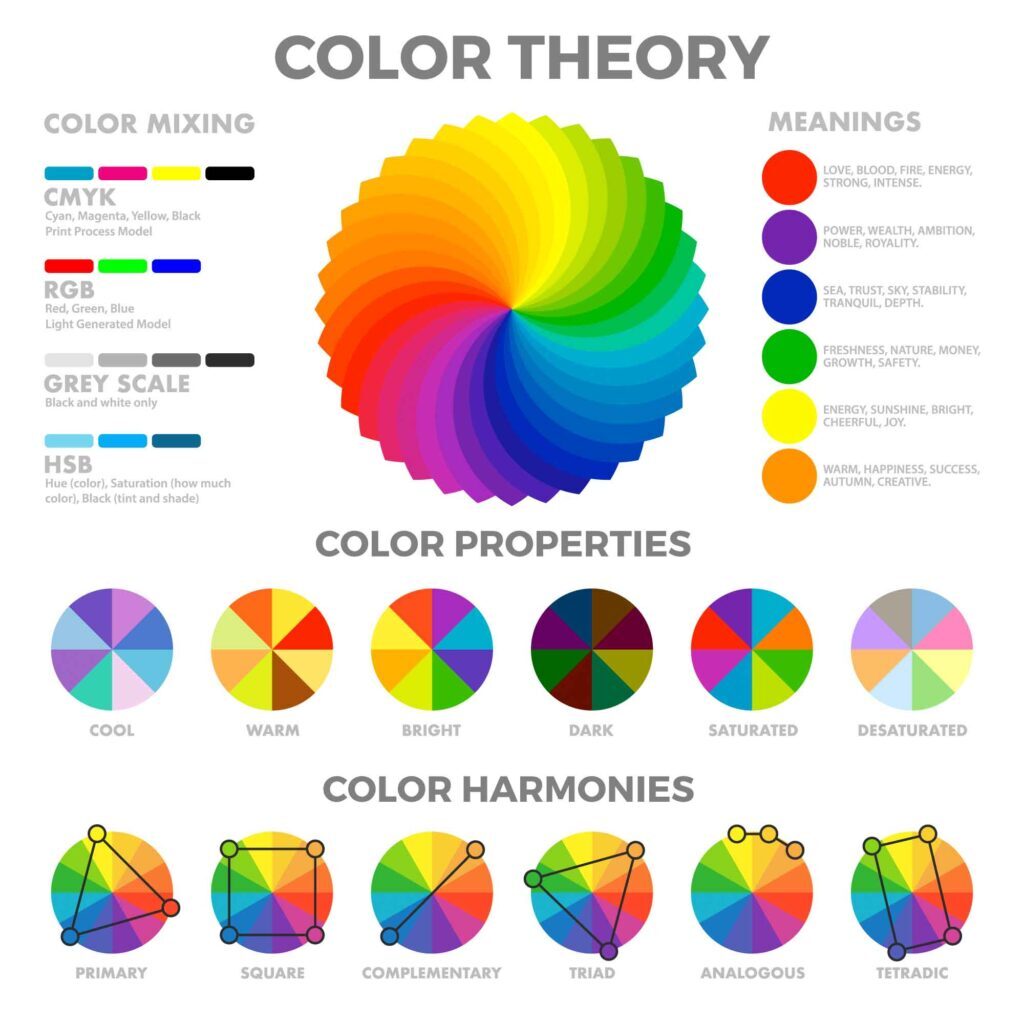
Moses Harris, author of the “Natural System of Color,” describes the regular and beautiful order and arrangement arising from the three primaries, red, blue, and yellow; the way each color is formed, and its composition; the dependance they have on each other, and by their harmonious connections are produced the tints, or colors, of every object in the creation. And those tints, though’ so numerous as 660, are all formed in thirty-three terms.
The Munsell color tree (three-dimension system) stands for three attributes of color: Hue, Value & Chroma to shows how colors vary from their different properties.
As a color theorist, Josef Albers made some assertions that color was best studied through experience. He characterized color as being passive, deceiving, and unstable. However, after enough experimentation, an artist (or quilter, for that matter), can learn to predict the behavior of color through experience. In his teachings at Black Mountain College, which were later perfected at Yale, he showed that if you put a certain color next to another, and another color after that, you can expect certain results. Source: Joseph Albers color theory
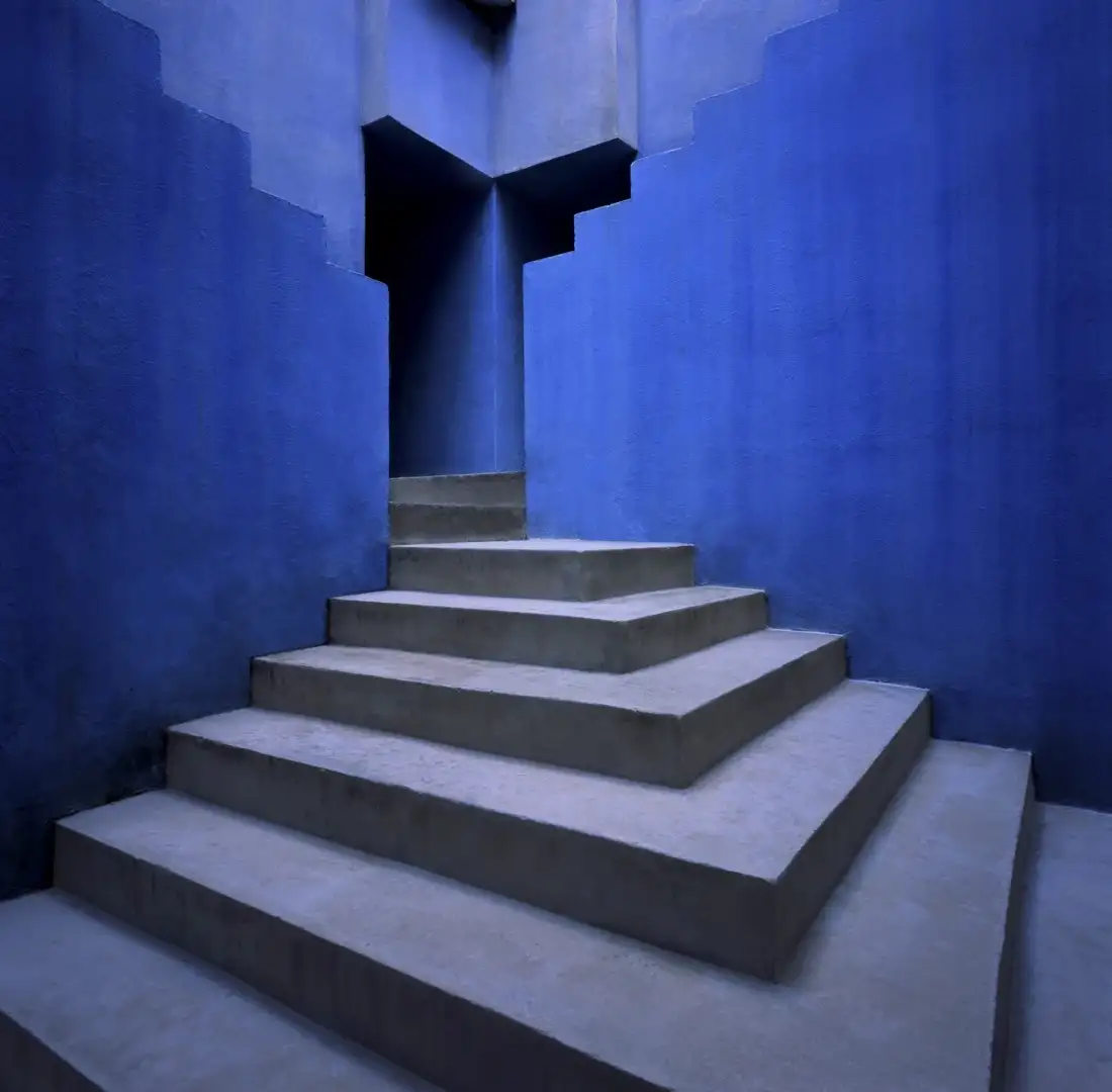
BLUE
Effect: retiring, relaxing
Association: Positive: calm, sober, secure, comfortable, noble
Negative: frightening, depressing, melancholy, cold
Character: Blue appears to be transparent, wet, cool, and relaxing.
Walls: cool and distant (if light), encouraging and space deepening (if dark)
GREEN
Effect: retiring, relaxing
Association: Positive: tranquil, refreshing, quiet, natural
Negative: common, tiresome, guilty
Character: Contrary to red, when looking at green the eye focuses exactly on the retina
Walls: cool, secure, calm, dependable, passive, irritating if glaring (electric green)
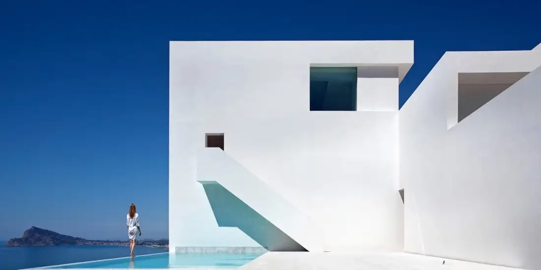
WHITE
Effect: disconcerting
Association: Positive: clean, crisp, bright
Negative: empty, sterile
Character: There are a lot of psychological and physiological justifications for not using white as a dominant color.
Walls: neutral to empty, sterile, without energy
Architectural Environments — Emotions and Psychosomatics
Emotions are produced by the environment, and these emotions are linked to psychosomatic diseases. Psychosomatic medicine emphasizes that physical disorders may originate from psychological factors, be aggravated by them, or vice versa. It is common knowledge that stress may cause headaches, anxiety makes the heartbeat faster, and anger and distress may affect the stomach, to name the most common occurrences like high blood pressure, heart palpitations, migraine headaches, eczema, impotence, and so forth. Scientific research has also set up the link to PNI, or psycho-neuro-immunology, which clearly shows that networks of nerve fibres and molecular bridges connect the psyche and the body with each other and that emotions penetrate completely into the cells of the organism.
Color with different properties
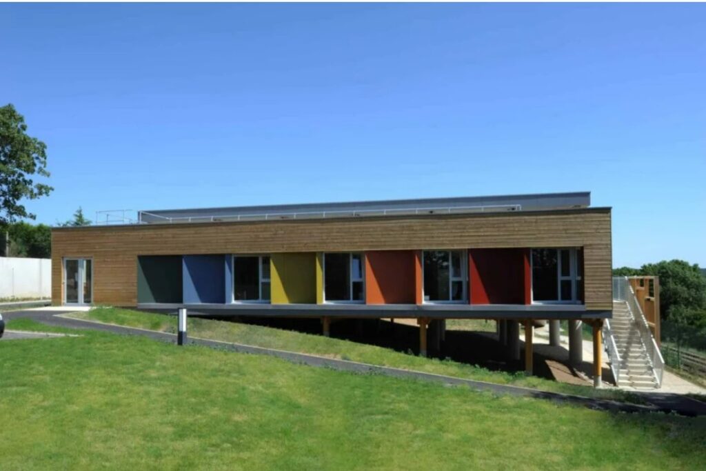
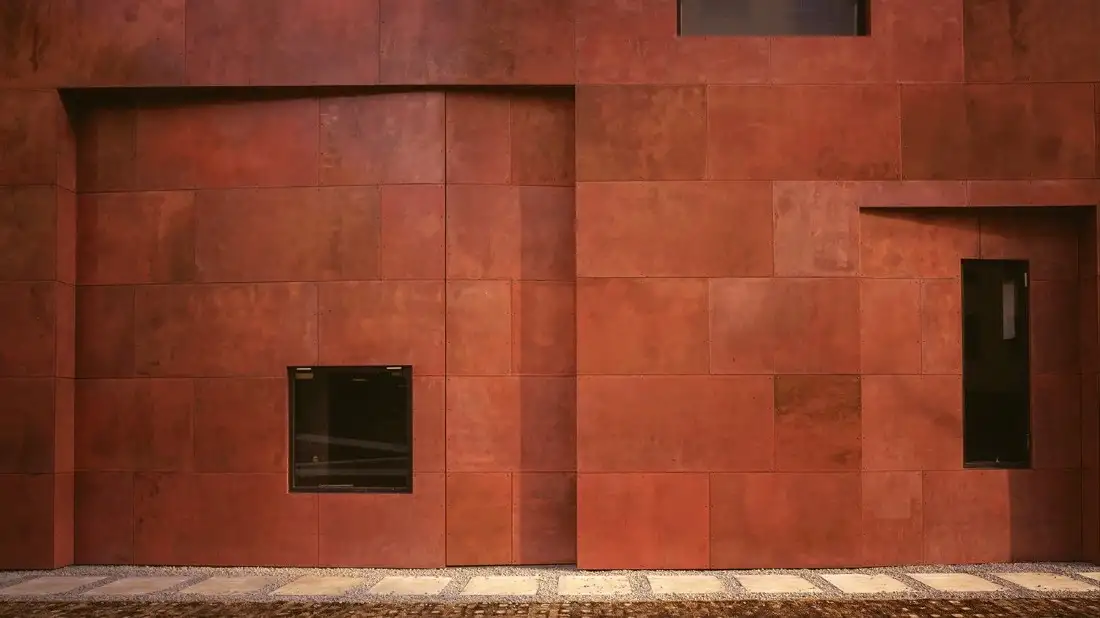
Color emphasizes the texture of any material-oriented identity, such as rough, soft, patterning, or opaque surfaces. Its color defines the material in a new way. Gray concrete is a full, heavy, and dull environment, while painted white concrete blocks are a positive and peaceful environment. Same texture but assorted color:
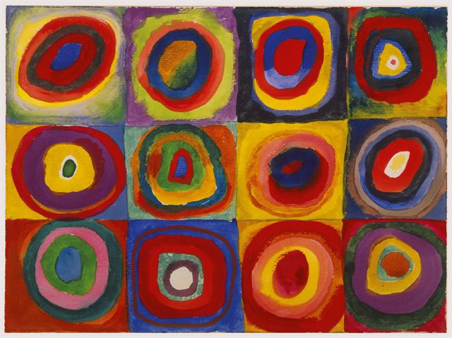
Wassily Kandinsky’s art explored the relationship between color and its viewers. He eschewed the grays, browns, and blacks of cubism, embracing color as the primary vehicle for expression. In doing so, he completely separated painting from a need to depict a subject. The goal of Kandinsky’s art was to capture music in a plastic medium and evoke the same feelings a piece of music could evoke through shades and hues. Source: Color Study by Wassily Kandinsky
History of Color’s use in Architecture
Every place, on every continent, has its own shape and physical characteristics that distinguish cities and human settlements. evolution of architecture through the combination of varied materials for creating natural colors, such as using rose petals for red, sand for brown, and crushed leaves to produce green.
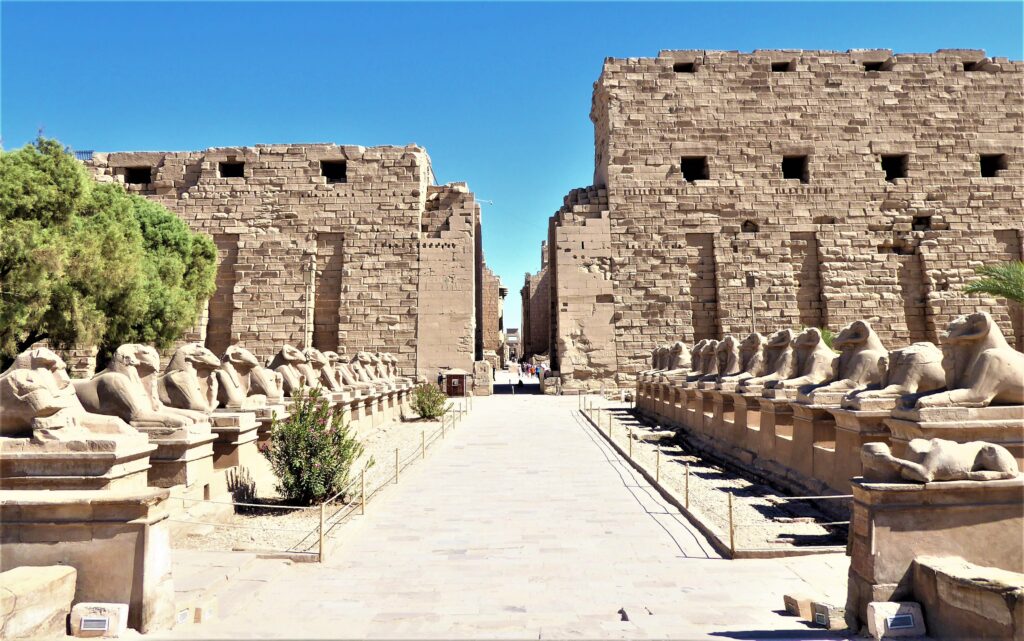
Marie Lewis had authored her theses on color in architecture in 1930 for the University of Chicago, and she describes in her study that in the exterior form of buildings, color had been represented by ancient Assyrians and Egyptians in the Gothic period. Each great nation is formed through its geology, geography combines with architecture to create a unique form. That results in a civilization of culture and art, and its craft is contextualized using color and form.
The ancient art of Egypt is easily recognizable because of its geological and geographical conditions. Its neighbourhood is not easily commutable by other countries to exchange art or ideas, so the possibility of producing highly individual art remains. Materials included burned bricks, a few trees for fuel, and excellent clay deposits in the Nile River. But limestones, granites, sandstones, and gypsum were prepared for combining plasters.
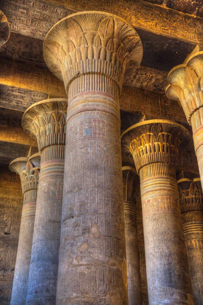
The Egyptian palette used earthy materials for primary tones like red, blue, yellow, and green, and neutrals like brown, black, and white. The green was a mixture of blue and yellow. The bright blue is created by combining minerals such as copper fillings, sand, and sub-carbonate soda. Central Asia via imported powder lapis lazuli used in the production of ultramarine. White is made with lime or gypsum. These colors were mixed with water and some flexible gum, such as tragacanth. Sometimes honey was used as a grounding material for these pigments. application of color on exterior and interior with decoration of pictorial and hieroglyphic carvings, which were highly colored with tones to be described, and that entire process made building an ancient craft for its future generation. The climate played a significant role in the decision to paint exterior walls that show brown or yellow stone to protect from sun rays. The crudity of the coloring was lost in the sun’s intense light.
The architectural value of carved walls was achieved primarily through outlining, followed by color application. There were no windows on the walls, which was the only reference for people to make new structures. The sense of color harmony seems to have been advanced and presented in such a satisfactory manner that it has never been equalled unless it was by the Greeks.
Use of Color in Architecture design process
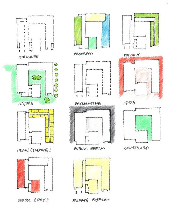
Any architectural building design process begins with color-coded diagrams that show the spaces to create a visual of the space. Legends, zoning, or bubble diagrams. Color serves as a parallel in producing drawings on paper or software to interpret design concepts. Differentiate zones and legends on maps and plans, color is a fundamental tool. It divides space, room, area, zone.
Use of Color in Urban design/planning
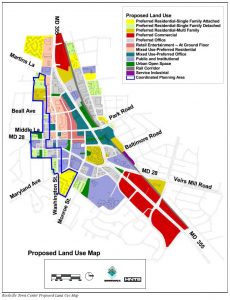
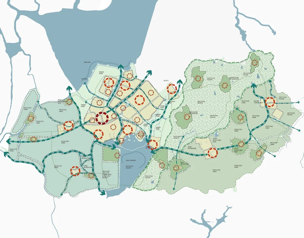
Color is used more often in urban design drawings than in architectural design. The primary use of color in urban design is to categorize and clarify copious amounts of visual information. Represent a city’s use patterns, comprehensive plans and land use maps use standard coded colors. Digital technology has supplied easy access to city maps, plans, and aerial photography of cities.
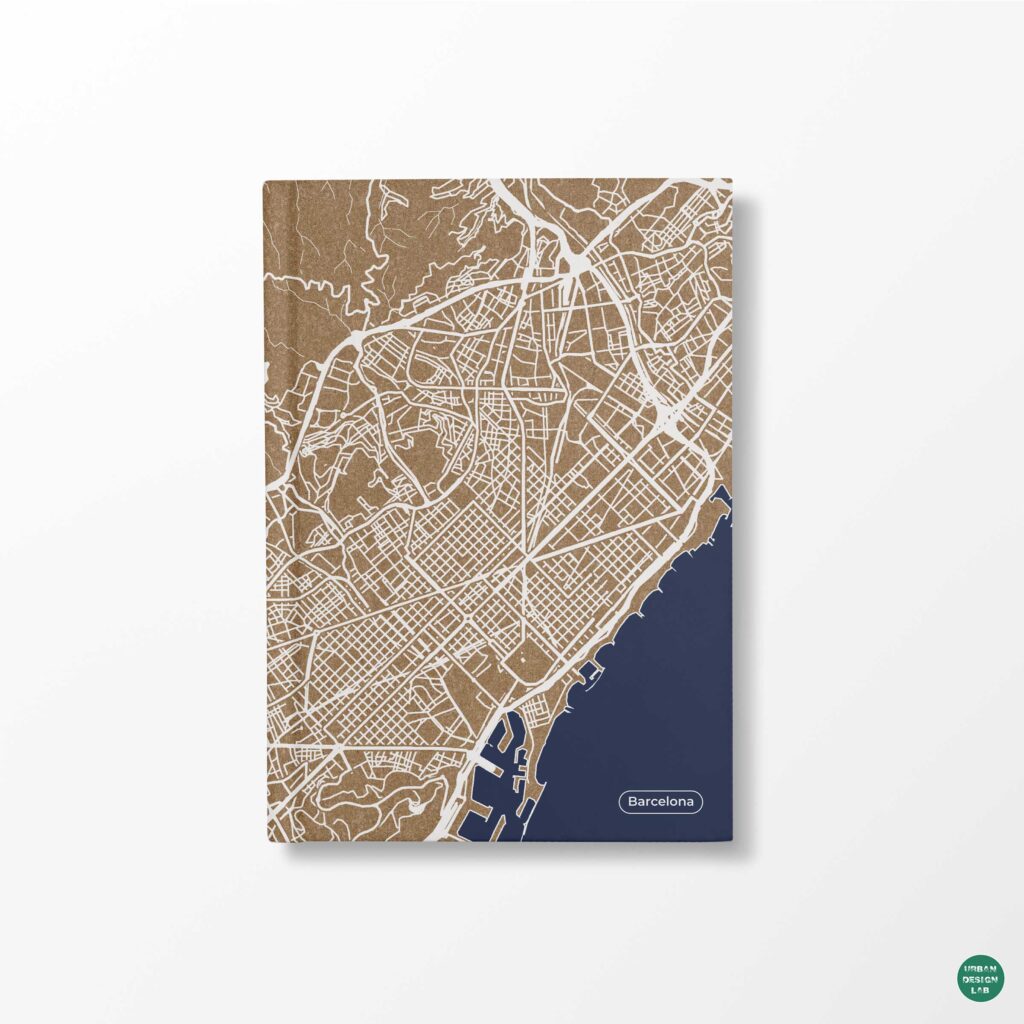
Streets also play a key role in this urban fabric. In formal analytical terms, a city street is a center between two perimeter walls and is experienced as a volume, or room, defined by these walls. The streets are the largest public realms in the city. Streets also form the personality of a district within the city: its energy, its movement, and the kind of public life generated there.
Conclusion
As per the above theories, data and case studies show the evolution of color in architecture through senses, comfort, mood, and history. Architecture lacks identity without color. It plays a vital role in architecture, building, urban design, and every day. Color is way more than an aesthetic part of design.
Color theory and its techniques show the value and use of color in human harmony, allowing us to understand its dynamics and tactics. Color and its uses with psychics and senses are all related to interior design codes, urban design codes, and highway codes. Shapes (form), material (texture), Light. Volume and color all work in parallel to make space useful for the area.
Reference
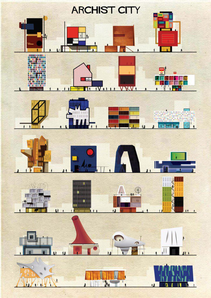
Color-painting by Architect-Graphic artist Federico Babina- Archtis https://federicobabina.com/ARCHIST
The color importance in Architecture, https://mengeotetassocies.com/en/the-importance-of-color-in-architecture/
Color Theory 101: A Complete Color Guide, https://www.colorsexplained.com/color-theory/
Joseph Albers color theory, https://carolinaoneto.com/josef-albers-and-color-theory/
https://medium.com/studiotmd/the-perception-of-color-in-architecture-cf360676776c
Color study by Wassily Kandinsky
Color Study: Squares with Concentric Circles by Wassily Kandinsky, https://www.wikiart.org/en/wassily-kandinsky/color-study-squares-with-concentric-circles-1913
A history of color in Architecture Thesis pdf by student Marie Lewis under The University of Chicago, Illinois -1930
Karnak Temple XIX Dynasty Monument, https://discoveringegypt.com/karnak-temple/karnak-temple-first-pylon/
2008 Society of Dyers and Colourists, https://www.aic-color.org/resources/Documents/jaic_v2_02.pdf
The Most Powerful Thing to Make People Understand Your Project; Diagrams by Begüm Şardan 27 January 2019, https://illustrarch.com/articles/701-the-most-powerful-thing-to-make-people-understand-your-project-diagrams.html
Field survey 2020 Land use map, https://i.pinimg.com/originals/3b/12/da/3b12dae48e757cf43a608d1edac8a3a3.png
Color & space with Architecture thesis pdf by student Nora Luehmann, University of Cincinnati -2004
Robert Slutzky in Architecture is Inseparable from Color
Shailee Bhatt is an Architect & Urban Designer. She did work on projects like education campus design, garden redevelopment projects, and economically weaker section housing master plans for India. Her volunteer work in the Green Impact Jury Report was the first prize winner in the UK, for Leeds Beckett University. Shailee likes to put her ideas and imagination into master planning & designing better public spaces. She follows architecture through art. Her designs are based on context. Her methods of visualization are through paint strokes and sketches. Shailee’s ideology of working for the public is to give language and definition to every element for its routine purpose, which must be healthy and sustainable.
Related articles


GIS Mapping Tools Every Urban Planner Should Know

From Thesis to Portfolio – Free Ebook

Spatial Analysis with GIS – Free Ebook
UDL GIS
Masterclass
GIS Made Easy – Learn to Map, Analyse, and Transform Urban Futures
Session Dates
4th-8th May 2026

Free E-Book
From thesis to Portfolio
A Guide to Convert Academic Work into a Professional Portfolio”

Urban Design Lab
Be the part of our Network
Stay updated on workshops, design tools, and calls for collaboration
Recent Posts
- Article Posted:
- Article Posted:
- Article Posted:
- Article Posted:
- Article Posted:
- Article Posted:
- Article Posted:
- Article Posted:
- Article Posted:
- Article Posted:
- Article Posted:
- Article Posted:
- Article Posted:
Sign up for our Newsletter
“Let’s explore the new avenues of Urban environment together “

















5 Comments
Thank you so much for sharing this information. It is very useful information for Businesses.
Thank you so much for sharing this information. It is very useful information for Businesses. Roofing Contractors
The CulversFeedback is an excellent opportunity for Culver’s fans to share their dining experience and receive a reward in return. It’s quick, simple, and benefits both the customer and the restaurant. If you have a recent Culver’s receipt, don’t miss your chance head to website and claim your reward today!
https://tellculvers.beer/