Urban Design Presentation Ideas
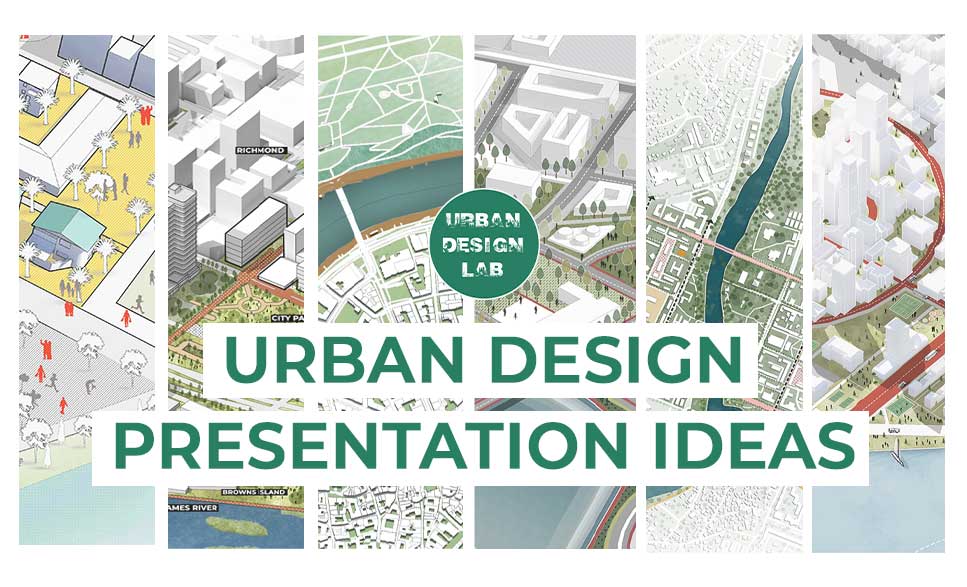
Making excellent presentations about urban design is in and of itself an art form. Because a bad presentation can permanently bury a brilliant idea, regardless of its originality. It entails convincing a potential customer that it is their best choice. Now, this might seem a little too challenging, but it’s really not. Actually, creating a good presentation is more like adhering to a formula that ensures excellent results.
In this article, you can read out about tried-and-true methods to improve your urban design presentations.
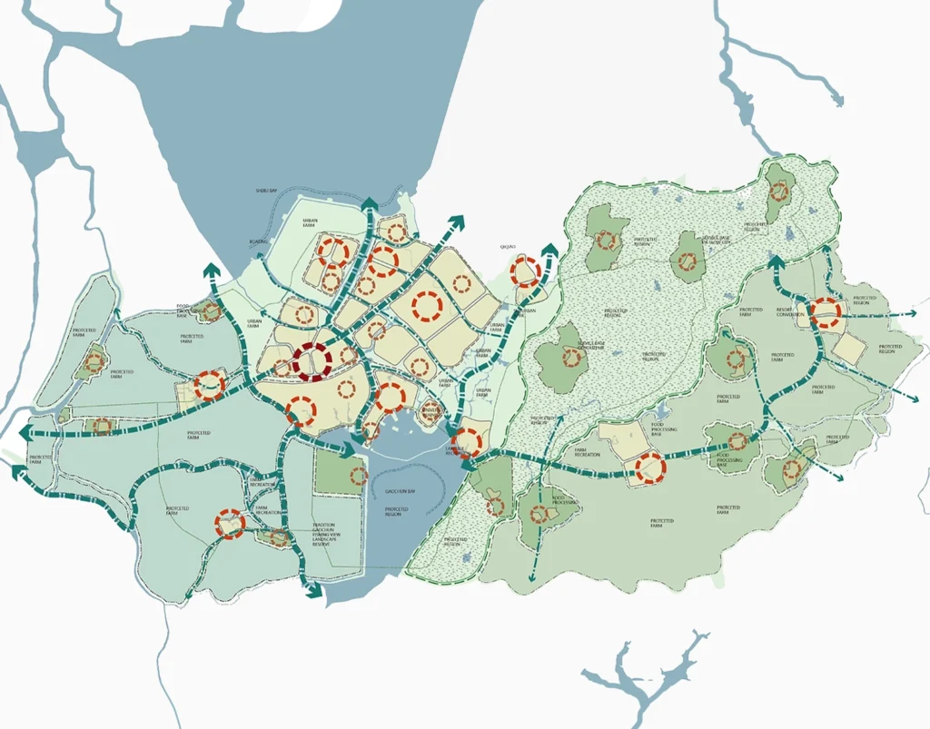
Representing Mapping
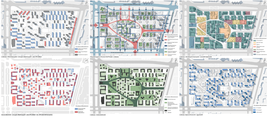
To reflect your design concept and effectively convey the specifics and key elements of the scheme, your presentation board must have both text and graphics. When creating maps, it’s crucial to be efficient and utilise exactly what’s required to get your point through. Quality is preferable than quantity because the latter can cause confusion. Consider how simple or complex the idea, key components, and core ideas of the scheme are to understand when you approach your project from scratch.
Bring your work together as a cohesive group of drawings in a format, scale, and style that complement one another to produce a logical and thorough understanding of the project. Lack of clarity and misunderstanding can result from inconsistent visual styles.
You can also read:
Structure of the presentation board
Take some time to plan out your layout before you begin making your presentation boards. What is it that you hope to say? What kinds of pictures or sketches must you submit as part of your evaluation? What do you want people to take away from your design?
Information gathering, including making a list of all the images to be featured and the text you would like to place on them, is the first step in arranging the layout of your boards. This will be a great aid in imagining the content of your boards and the means through which you will convey your design.
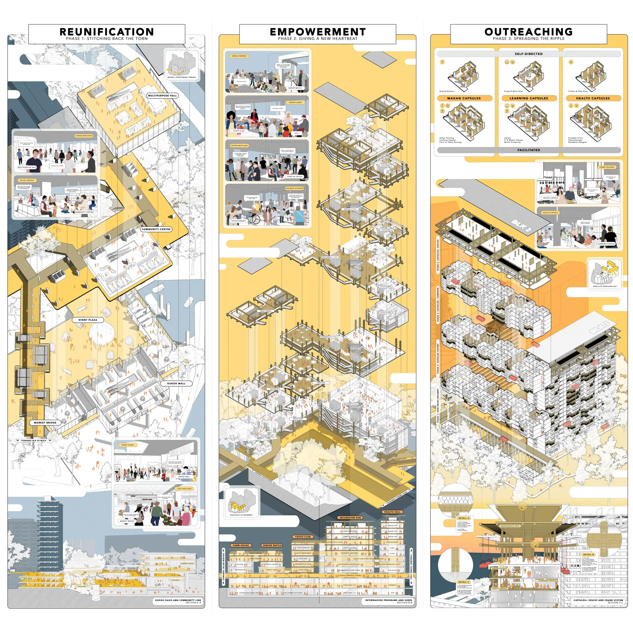
Orientation, setting and size
Are there any restrictions on how your presentation boards must be oriented? Make sure you are aware of whether your boards should be shown in portrait or landscape format.
If you are unsure whether this is something you should think about, examine how the boards will be viewed and whether they will be displayed in a succession so they build on one another.
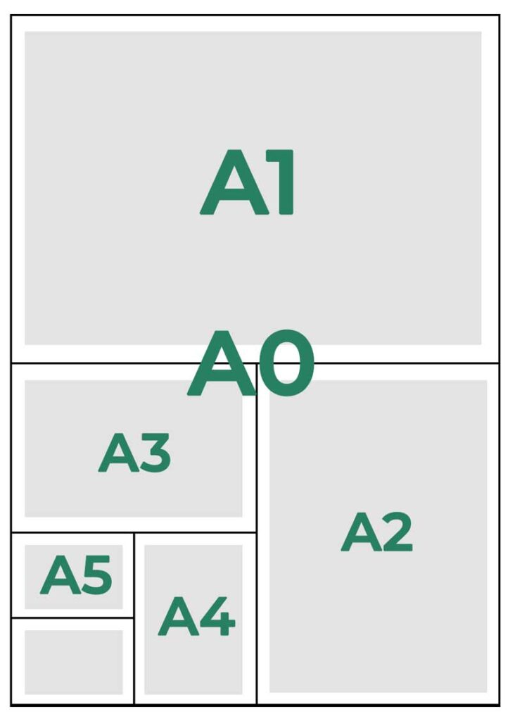
What dimensions will your presentation boards have? Make sure you are aware of any board size restrictions.
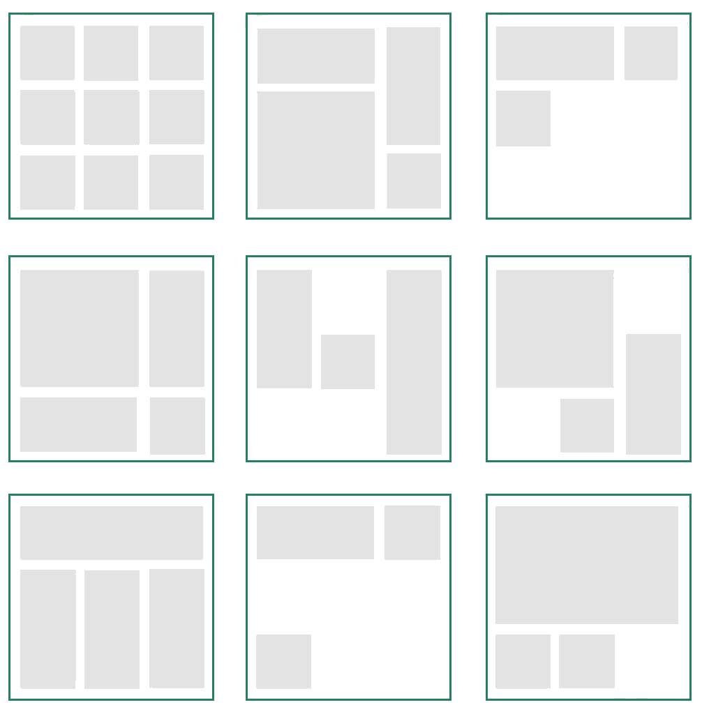
Layout of the presentation board
To assist you in organising the visual components on your board, think about employing a grid. Use a straightforward grid or something more intricate. You can organise the pieces on your page and create uniformity throughout the collection of architecture presentation boards by using a grid.
You may start making a grid that meets your needs once you’ve chosen your page size and orientation. Title bars, page numbers, and other information that must appear on each board can be included in the grid. It’s fantastic to use a programme like InDesign because you can set up master pages as templates, requiring just one grid creation to be utilised on many pages.
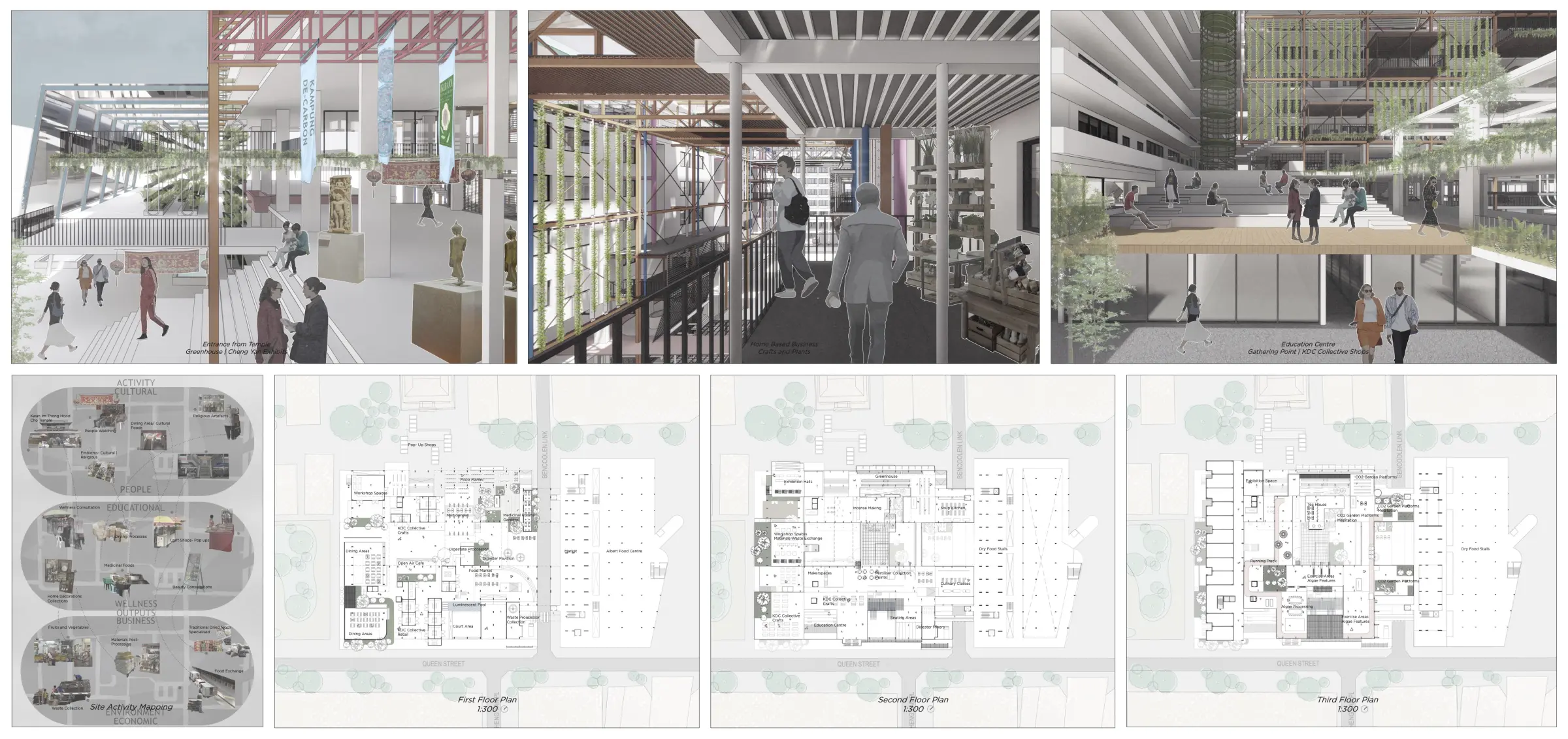
Presentation Board Essentials
Well, that’s complicated, because it depends on the results you’ve achieved and the specifications of the project brief. Therefore, pick the pictures and sketches that best illustrate your design. What information would you need to see in this project’s initial presentation in order to grasp its significance?
.webp)
Information – Title, story, content
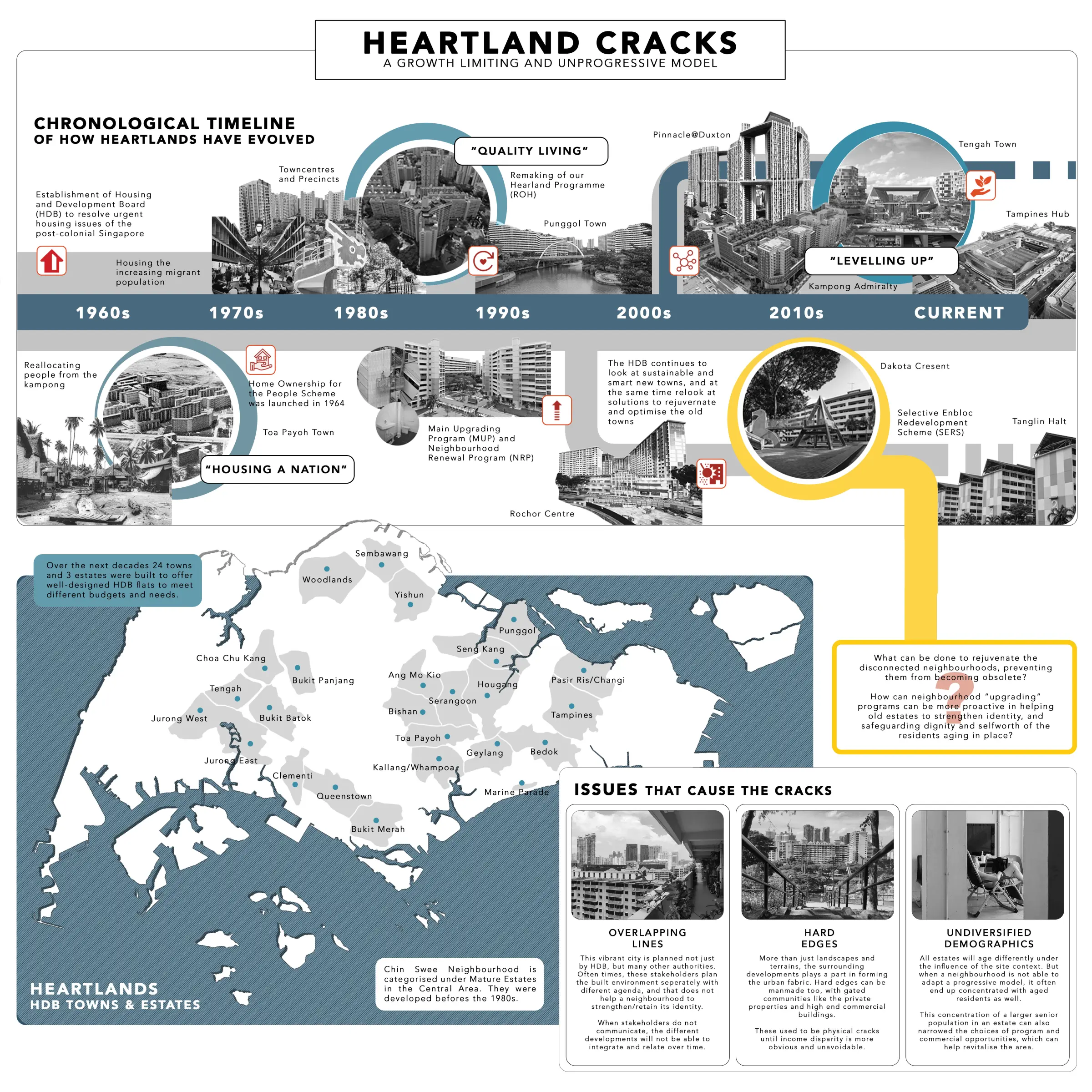
Does having a title bar matter? If so, think about using a title bar that is the same throughout all of your boards to give them a professional and organised appearance. Don’t forget to provide your contact information, including your name, project title, and any other pertinent information.
Text
It can be tempting to use too many fonts, but please resist the urge! Limit yourself to no more than two fonts. Create a hierarchy using font sizes by using huge font for titles, somewhat smaller for subtitles, and regular size for the rest of your text. Make sure the font and size you choose are readable! Keep your phrases succinct and to the point. An essay on your presentation board won’t be something anyone wants to read. An image is worth a thousand words.
Think about the text box’s text alignment. What can I read more easily? Consider how word spacing, hyphenation, and other formatting will look on your presentation board for architecture. 12 point text on A1 paper is the same size as 12 point text on A4 (or Letter)
You may also read:

.webp)
Use of Nagative Space
Use negative space. Don’t fill your board with useless information, use the negative space to set off your design and make it stand out.
.webp)
Use of Isometric and Axonometric views
An axonometric perspective, also called parallel projection or axonometry, is an orthographic projection on an oblique plane as a means of representing three-dimensional objects. It is a very efficient way to illustrate a project since it can represent not only conceptual schemes but also construction details in a very didactic style. It allows us to change the position of the viewer when rotating the axes and thus generating several visual combinations of the design, that can help answer any questions the contractor or client may have.
Isometric drawings are a powerful tool for visually communicating complex spatial arrangements. Their unique viewpoint allows for highly descriptive drawings that represent three-dimensional space on a two-dimensional surface.
.webp)
Use of Planometric drawing
A planometric drawing is a type of three dimensional drawing that includes an accurate ‘plan view’ or top view of a single plane, like a floor plan. The planometric view is a “parallel projection” system. All of the parallel projection systems (isometric, axonometric, and planometric) do not depict how objects appear to get smaller as they move further from the viewer. A ‘perspective projection’ of parallel lines shows them gradually converging until they touch at a ‘vanishing point’. Parallel lines in parallel projections are depicted as parallel.
Planometric drawings are used to show that depth exists but to leave the plan view unaltered. I once saw a map of a museum that used a planometric view so each gallery was displayed to scale and with nothing obscured.

Use of perspective section
The perspective section is an increasingly popular form of architectural representation, one that is most commonly used in architectural competitions since it allows a technical drawing to be mixed with an image, a section which allows one to easily express the qualities of the space designed in a two-dimensional drawing. Below, we have put together a selection of impressive perspective sections ranging from a realistic aesthetic to a line drawing by hand.
.webp)
Use ofIsometric Perspective for design development
Isometric diagrams in architecture, landscape, and urban studies are a wonderful tool that help reveal spatial relationships without adding too much decorative details. Simply put, isometric drawings are informative, yet pleasantly abstract.

Use of good digital resources
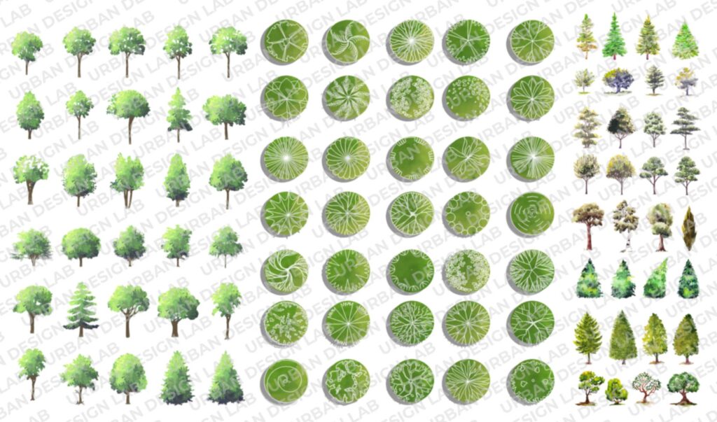
The selection of the best digital resources such as trees, landscaping and streetscaping elements, human cutouts, clouds etc also plays a very important role in making your urban design presentation board excellent. You can view numerous digital resources on UDL Digital Resource portal. UDL Digital Resources is an online repository containing everything an architect or designer needs for their design. Finding the right PNGs is a lengthy process, made even more so when they must then be placed and given the proper lighting and color to blend into the drawing. When combined with the appropriate presentation tools, cut-out people create an illustration narrative and establish a relationship and connection between the viewer and the location and space. We’ve compiled a list of the best products for which you can use in commercial, academic, and research projects.
Enhance your representation skills
The success of urban design presentations increases the success of the projects and you can show your projects much better with a good presentation. Otherwise, if your presentations are not successful, your projects will not be perceived as perfect, even if they are perfect and complete. To enhance your presentation skills, Urban design la in collaboration with experienced moderators, over the due course of time has brought multiple intriguing workshops that integrate 3D visualization, urban analysis and mapping techniques that enables the participants to not only represent two dimensional drawings, but also to visualize three dimensional renders.
The live hands-on masterclasses integrate multiple software such as Sketch-up, 3ds Max, Illustrator, Autodesk Sketchbook, Procreate etc., where the participants are made familiar with the secrets of the designing, modelling, rendering and Post-Production processes.
Click here to know more about Integrated UDL Masterclass Session.
Urban Design Lab
About the Author
This is the admin account of Urban Design Lab. This account publishes articles written by team members, contributions from guest writers, and other occasional submissions. Please feel free to contact us if you have any questions or comments.
Related articles


Remembering Frank O. Gehry: The Architect Who Redrew Skylines

Architecture Professional Degree Delisting: Explained
Periodic Table for Urban Design and Planning Elements
UDL INDESIGN
MASTERCLASS
Learn to Design Portfolios, Publications, and Presentation Boards
Session Dates
30th May 2026
Free E-Book
From thesis to Portfolio
A Guide to Convert Academic Work into a Professional Portfolio”

Urban Design Lab
Be the part of our Network
Stay updated on workshops, design tools, and calls for collaboration
Recent Posts
- Article Posted:
- Article Posted:
- Article Posted:
- Article Posted:
- Article Posted:
- Article Posted:
- Article Posted:
- Article Posted:
- Article Posted:
- Article Posted:
- Article Posted:
- Article Posted:
Sign up for our Newsletter
“Let’s explore the new avenues of Urban environment together “
