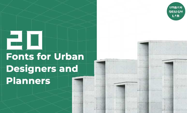
Most of us think of urban designers and planners primarily as those who design the cities. What is overlooked, however, is how time-consuming, difficult, and unpleasant it can be to design and build cities that are more than just visually pleasing and functional. Picking the right font might be difficult.
A good or bad typeface can have a significant impact on how your design is received and how interested the reader is. However, if you don’t already have a couple of reliable options in mind, choosing a typeface for your next project can be a difficult ordeal. Because of that, we have compiled a collection of 20 fonts that will help you reimagine your next urban project.
What is a font?
When referring to typefaces, the term “font” refers to a particular combination of point size, weight, and style that was used in metal typesetting. A variety of these typefaces that are similar in style would make up the typeface (the typeface).
Today however with digital typography now very dominant, the term font is more commonly associated with/to a typeface, where each font file is a different design.
For example the typeface “Futura” may include the fonts “Futura light”, “Futura italic”, “Futura bold” and “Futura extended”, but the term “font” might be applied either to one of these on their own or to the Futura font as a whole.
As well as the above variations (light, italic and bold), fonts can be categorized by their type of box (higher and lower case), by source, Sans – serif (without serif), Serif (with serif), Script (cursive) and Dingbat (ornamental), in addition to numerous other identity features of the same style.
Bauhaus, a decorative typeface, is characterised by its clean, distinctive appearance achieved via the use of simple geometric forms and uniform strokes. This font, created by graphic artist Herbert Bayer in 1925, is still in use today. It is mostly used for titles and subtitles in architectural board layouts.
2. Futura
Paul Renner’s 1920s typeface is an iconic example of the genre of Modern Graphic Design. This design, which takes cues from Bauhaus principles, uses straight lines and curves in syntony to create harmony in its set of texts. The visual fatigue caused by prolonged usage of this font makes it inappropriate for longer writing, despite the fact that it is cleaner. Indicated titles and subtitles in the architectural boards with punctuation. Used extensively for branding purposes, it may be found in all the best office buildings.
3. Helvetica
Helvetica is a great option for portfolios going for a clean, contemporary look. Its neo-grotesque aesthetic makes it compatible with many standard typefaces, including Lucida, Open Sans, and Georgia. The Swiss design team of Eduard Hoffmann and Max Miedinger created this font in the previous decade, and it has received widespread appreciation for its clean, readable layout. It sees extensive application in the design of logos and websites.
4. Bodoni
This font, designed by Giambattista Bodoni in 1767, has a lot of visual power and should be used with caution because of it. It is not recommended for lengthy texts, but rather for titles and information due to the set of lines and prominent presence of its letters.
5. TK-Architect
TK-ARCHITECT is a true type format with regular style available for MAC & PC.Its character map contain uppercase alphabets and numbers. Family : TK-ARCHITECT
6. Lato
Used on more than 9.6 million websites, Lato is the 3rd most served font on Google Fonts, with over one billion views every day. Lato was designed by font designer Łukasz Dziedzic in 2015. It is a free humanist sans-serif typeface which is being widely used as an architecture font.
7. Poplar
This font presents strength and personality in its composition. It was designed by Barbara Lind and is a part of Adobe. Poplar is perfect for a wide range of applications, including boards, diagrams, and schemes. It is also suitable for titles, subtitles, and details.
8. IBM Plex
Developed by Mike Abbink this font is the corporate typeface for IBM worldwide. It was developed at IBM in collaboration with Dutch type foundry Bold Monday mainly to reflect the brand spirit. Plex was released as an open-source project in 2017 and includes Sans, Sans Condensed, Mono and Serif.
9. Monolisk
This font was developed by Studio Buchanan after being inspired by Eastmodern and Brutalist architecture. Monolisk is a very sturdy and powerful font with the gothic typeface. It comes in 5 different weights plus stylistic alternate glyphs to truly broaden your horizons.
10. Cormier Typeface
Tugcu Design Co. invites you to go back to the time of glitz, glamor, and beautiful Art Deco in this lovely typeface that’s available in 3 styles – Rough, Double, and Regular.
11. Architext
Architext is a fun digital typeface inspired by the early era of personal computers. This font is perfect for impactful headlines, logos, layouts and content. Architect will pair beautifully with many fonts and may work well with whatever project you’re working on.
12. Amphi Typeface
Influenced by ancient roman style architecture, this gem from MikeHill has 3 styles (Regular, Stencil, Broken) that will instantly add a distinct character to your projects.
13. Blueprint Style Font
These letters on white by BestPics perfectly capture a blueprint, technical look. The hand-drawn geometric appearance is handy for either personal or commercial uses.
14. Architects and Draftsmen
Add an authentic retro feel to your designs when you use this offering from SouthpawMiller. This 1950s vintage serif is available in two styles with three weights each (that’s a total of 6 amazing looks!) for your convenience.
15. Freezer
True Story Letterworks proudly presents this futuristic typeface with wide proportions. Bold, clean, and contemporary, it’s best used in modern designs like branding projects and building corporate identities.
16. Fractul Font Family
Fractul Font Family is a wide range of architectural fonts. There are 36 different types in this family, each with its own characteristics. To design the magazine cover, consider the logo and poster of this font.
17. Sketchiqua
Sketchiqua Font designed by Manfred Klein is one of the practical architectural fonts with 4 different styles. This blueprint font family is allowed for personal designs only. Try it!
18. BrightonTwo Sans NBP
BrightonTwo Sans NBP is another one of the full-featured architectural fonts created by total FontGeek DTF, Ltd. 6 different styles are available for this versatile font family. Create a geometric look for your designs and enjoy it!
19. Bauhaus Sketch
Bauhaus Sketch Font by Typography in Decay is a constructional typeface. This is a free font for commercial and personal designs. This lovely font can surprise you, Try it!
20. Duerer Latin
Bauhaus Sketch Font by Typography in Decay is a constructional typeface. This is a free font for commercial and personal designs. This lovely font can surprise you, Try it!
This is the admin account of Urban Design Lab. This account publishes articles written by team members, contributions from guest writers, and other occasional submissions. Please feel free to contact us if you have any questions or comments.
“Let’s explore the new avenues of Urban environment together “
We use cookies on our website to give you the most relevant experience by remembering your preferences and repeat visits. By clicking “Accept”, you consent to the use of all the cookies. Read More
This website uses cookies to improve your experience while you navigate through the website. Out of these, the cookies that are categorized as necessary are stored on your browser as they are essential for the working of basic functionalities of the website. We also use third-party cookies that help us analyze and understand how you use this website. These cookies will be stored in your browser only with your consent. You also have the option to opt-out of these cookies. But opting out of some of these cookies may affect your browsing experience.
Necessary cookies are absolutely essential for the website to function properly. These cookies ensure basic functionalities and security features of the website, anonymously.
Cookie
Duration
Description
cookielawinfo-checkbox-analytics
11 months
This cookie is set by GDPR Cookie Consent plugin. The cookie is used to store the user consent for the cookies in the category "Analytics".
cookielawinfo-checkbox-functional
11 months
The cookie is set by GDPR cookie consent to record the user consent for the cookies in the category "Functional".
cookielawinfo-checkbox-necessary
11 months
This cookie is set by GDPR Cookie Consent plugin. The cookies is used to store the user consent for the cookies in the category "Necessary".
cookielawinfo-checkbox-others
11 months
This cookie is set by GDPR Cookie Consent plugin. The cookie is used to store the user consent for the cookies in the category "Other.
cookielawinfo-checkbox-performance
11 months
This cookie is set by GDPR Cookie Consent plugin. The cookie is used to store the user consent for the cookies in the category "Performance".
viewed_cookie_policy
11 months
The cookie is set by the GDPR Cookie Consent plugin and is used to store whether or not user has consented to the use of cookies. It does not store any personal data.
Functional cookies help to perform certain functionalities like sharing the content of the website on social media platforms, collect feedbacks, and other third-party features.
Performance cookies are used to understand and analyze the key performance indexes of the website which helps in delivering a better user experience for the visitors.
Analytical cookies are used to understand how visitors interact with the website. These cookies help provide information on metrics the number of visitors, bounce rate, traffic source, etc.
Advertisement cookies are used to provide visitors with relevant ads and marketing campaigns. These cookies track visitors across websites and collect information to provide customized ads.