Architecture Sheet Composition Guide
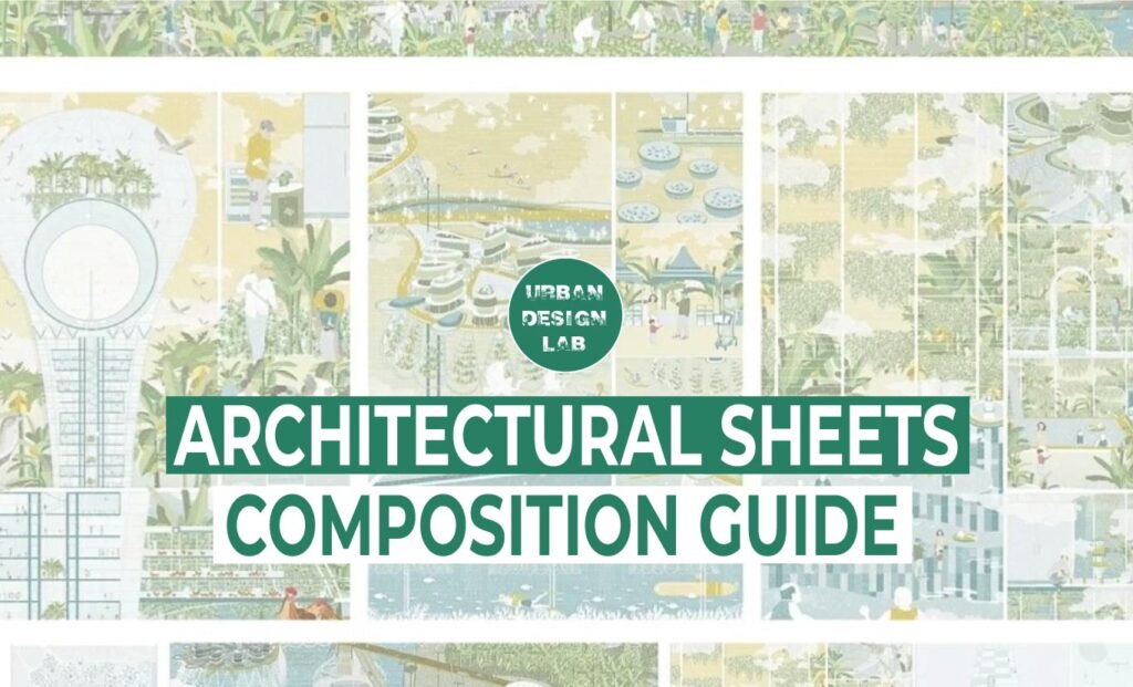
The art of architecture sheet composition is a vital component that is sometimes disregarded in the dynamic field of architecture, where form follows function. Acquiring this ability is not only necessary for designers and architects, but it also has a significant impact on how architectural projects are visually told. In this comprehensive guide, we delve deep into the intricacies of architectural sheet composition, equipping you with the knowledge and techniques needed to excel in this aspect of architectural design.
Understanding the Basics
What is Architecture Sheet Composition?
Architectural sheet composition, often referred to simply as sheet composition, is the process of arranging and presenting architectural drawings, plans, and visual elements in a coherent and aesthetically pleasing manner. These sheets serve as the primary means of communication between architects, clients, and construction teams.
Sheet Sizes in Architecture Sheet Composition
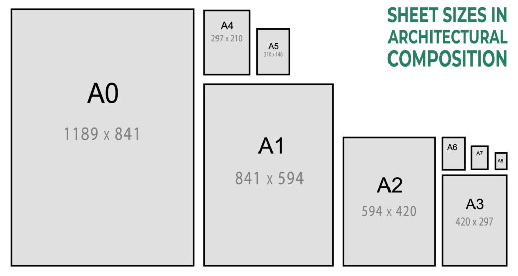
One aspect that often perplexes newcomers to architectural sheet composition is the selection of sheet sizes. The size of your sheets can significantly impact how your design is perceived and understood. Here are some common sheet sizes used in architectural composition:
- A0 (841 x 1189 mm): A0 sheets are the largest and provide ample space for detailed drawings and plans. They are often used for complex projects or when a high level of detail is required.
- A1 (594 x 841 mm): A1 sheets are slightly smaller than A0 and are a popular choice for presenting architectural designs. They offer a good balance between space and manageability.
- A2 (420 x 594 mm): A2 sheets are smaller and are typically used for presenting individual building sections or detailed components. They are handy for focusing on specific aspects of a design.
- A3 (297 x 420 mm): A3 sheets are smaller still and are commonly used for presenting building details or small-scale plans. They are practical for conveying information concisely.
- A4 (210 x 297 mm): A4 sheets are the smallest and are often used for notes, annotations, or supplementary information. They are not typically used for primary design presentations.
Important Architectural Sheet Components
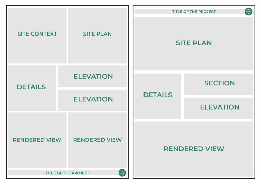
Understanding architectural sheet composition requires a thorough understanding of numerous essential elements, which include:
- Title Block: The title block is the first element that catches the viewer’s eye. It contains essential information about the project, such as the project name, architect’s name, date, and scale.
- Plan Views: Plan views showcase the layout of a building or space from a top-down perspective. They are crucial for understanding the spatial organization of a design.
- Elevations: Elevations provide a three-dimensional representation of the building’s exterior, highlighting details like facade materials, windows, and doors.
- Sections: Sections cut through the building to reveal its internal structure, allowing viewers to understand the relationship between different levels and spaces.
- Details: Detailed drawings zoom in on specific building components, such as joints, connections, and materials. These are essential for construction and often require meticulous attention.
- Rendering: Renderings are photorealistic depictions of the project, helping clients visualize the final result. They are a powerful tool for conveying the aesthetic aspects of a design.
Presentation Techniques: Drawing and Rendering Styles
When it comes to architectural sheet composition, drawing and rendering styles play a crucial role in conveying your design concept. Here are some popular techniques:
1. Hand Sketches:
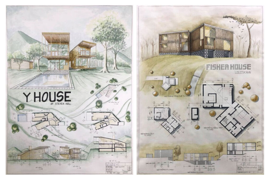
Hand-drawn sketches are an invaluable asset in architectural sheet composition, as they bring a unique and personal dimension to your design presentations. These sketches have the remarkable ability to convey the very essence of your design concept, particularly during the initial phases of a project.
2. Line Drawings:
Clean and precise line drawings form the very backbone of architectural presentations. Within the realm of architectural communication, they serve as the foundation upon which the entire design narrative is constructed. These drawings possess a unique ability to convey the architectural form and structure with unparalleled clarity and precision. Use different line weights to emphasize various elements.
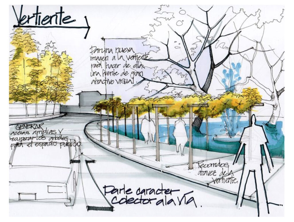
3. Watercolor Renderings:
Watercolor techniques have the remarkable ability to infuse your architectural sheets with a captivating sense of artistic flair. These techniques offer a unique way to bring life and vibrancy to your presentations, making them particularly valuable when showcasing outdoor spaces and landscapes within your architectural designs. In the realm of architectural presentation, where precision and technicality often reign supreme, watercolor stands out as a medium that adds a touch of creativity and emotion
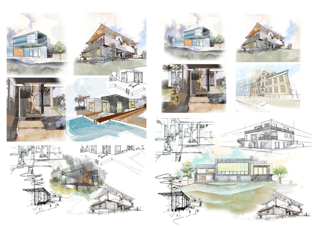
4. Digital Renderings:
In the digital age, architectural software tools have revolutionized the way architects and designers bring their visions to life. Among these tools, software applications such as SketchUp, V-Ray, and Lumion stand out as powerful assets that enable professionals to craft highly detailed and astonishingly realistic 3D renderings. These renderings, in turn, offer clients a true-to-life preview of what their finished architectural projects will look like.
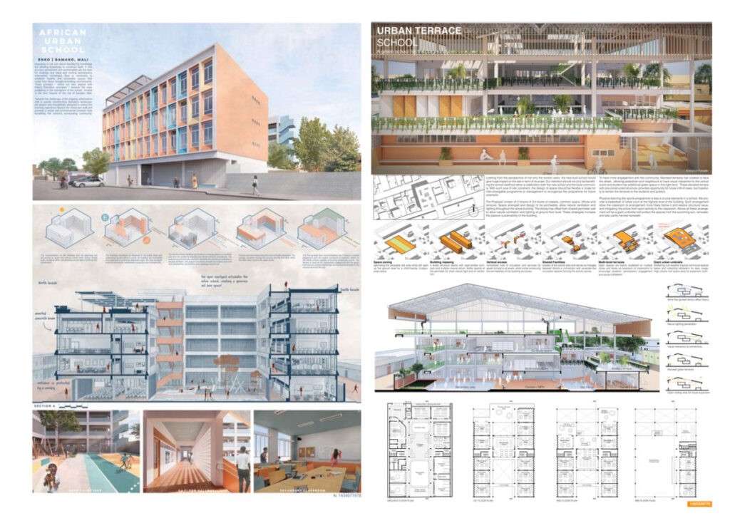
5. Collage and Mixed Media:
For a unique and innovative approach, consider using collage and mixed media. Incorporate photographs, textures, and other materials to create visually engaging sheets.For architects and designers seeking a truly unique and innovative approach to architectural sheet composition, the world of collage and mixed media offers a realm of creative possibilities. By incorporating photographs, textures, and a variety of other materials, you can craft visually engaging sheets that transcend the boundaries of traditional presentation techniques.

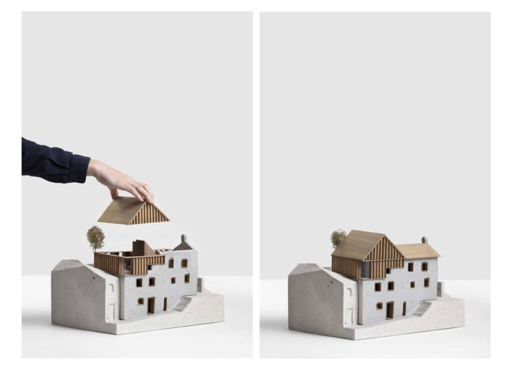
6. Model Photography:
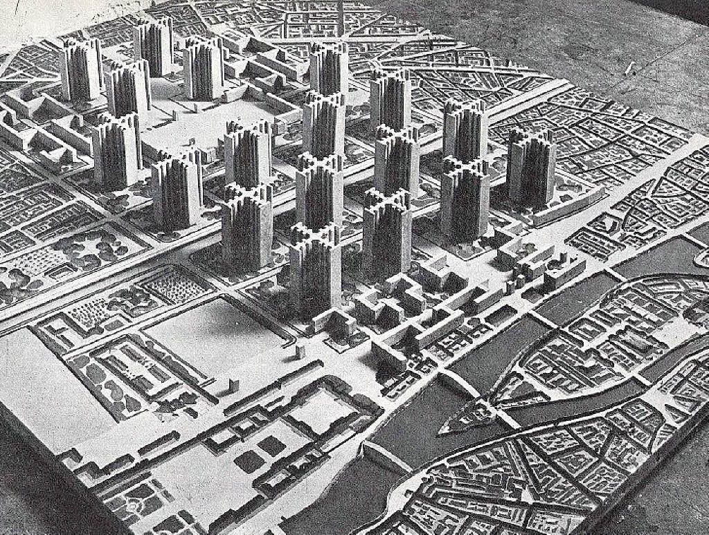
If you’ve created physical models of your design, high-quality photography can be a compelling addition to your sheets. It provides a tangible sense of scale and materiality. Creating physical models is an essential part of the design process for many architects. These models provide a tactile understanding of the spatial qualities and proportions of a project that may be challenging to grasp through traditional drawings alone. Physical models range from simple massing models to intricate, detailed replicas of the final design.
The Importance of Color Selection
The selection of colors in architectural sheet composition is of paramount importance. Colors play a multifaceted role in conveying the essence and character of a design. Here’s why color selection matters:
1. Mood and Atmosphere:
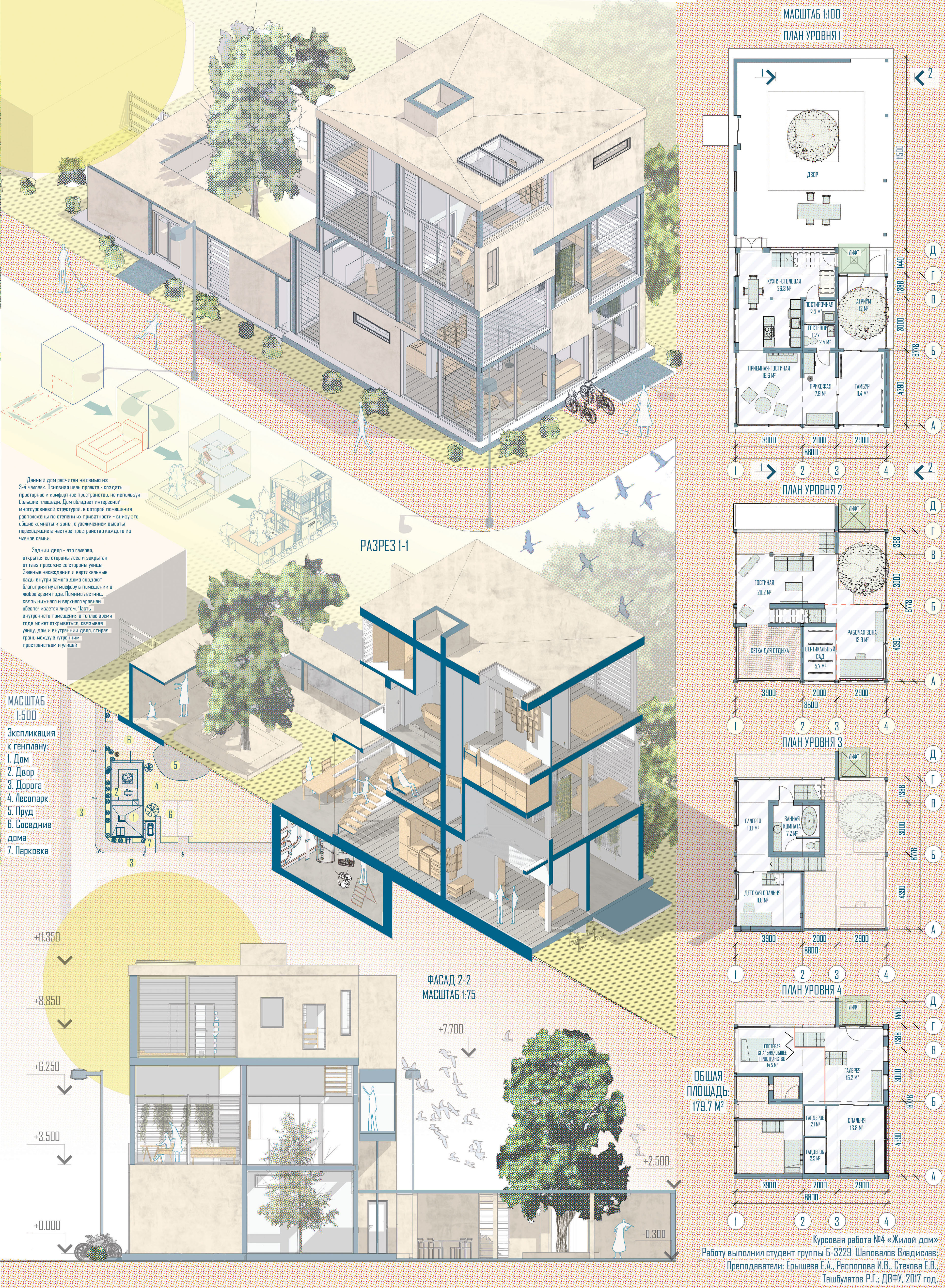
Colors can evoke specific moods and atmospheres. Warm colors like reds and yellows can create a sense of coziness, while cool colors like blues and greens can impart a feeling of calmness. Choose colors that align with the emotional tone of your project. The key lies in selecting colors that harmonize seamlessly with the intended emotional tone of your architectural project. By thoughtfully incorporating color into your presentation, you not only convey the aesthetics of your design but also invite your audience to experience the envisioned space on a visceral level. The strategic use of color can transform a mere presentation into a powerful medium for conveying the essence and mood of your architectural vision.
2. Visual Hierarchy:
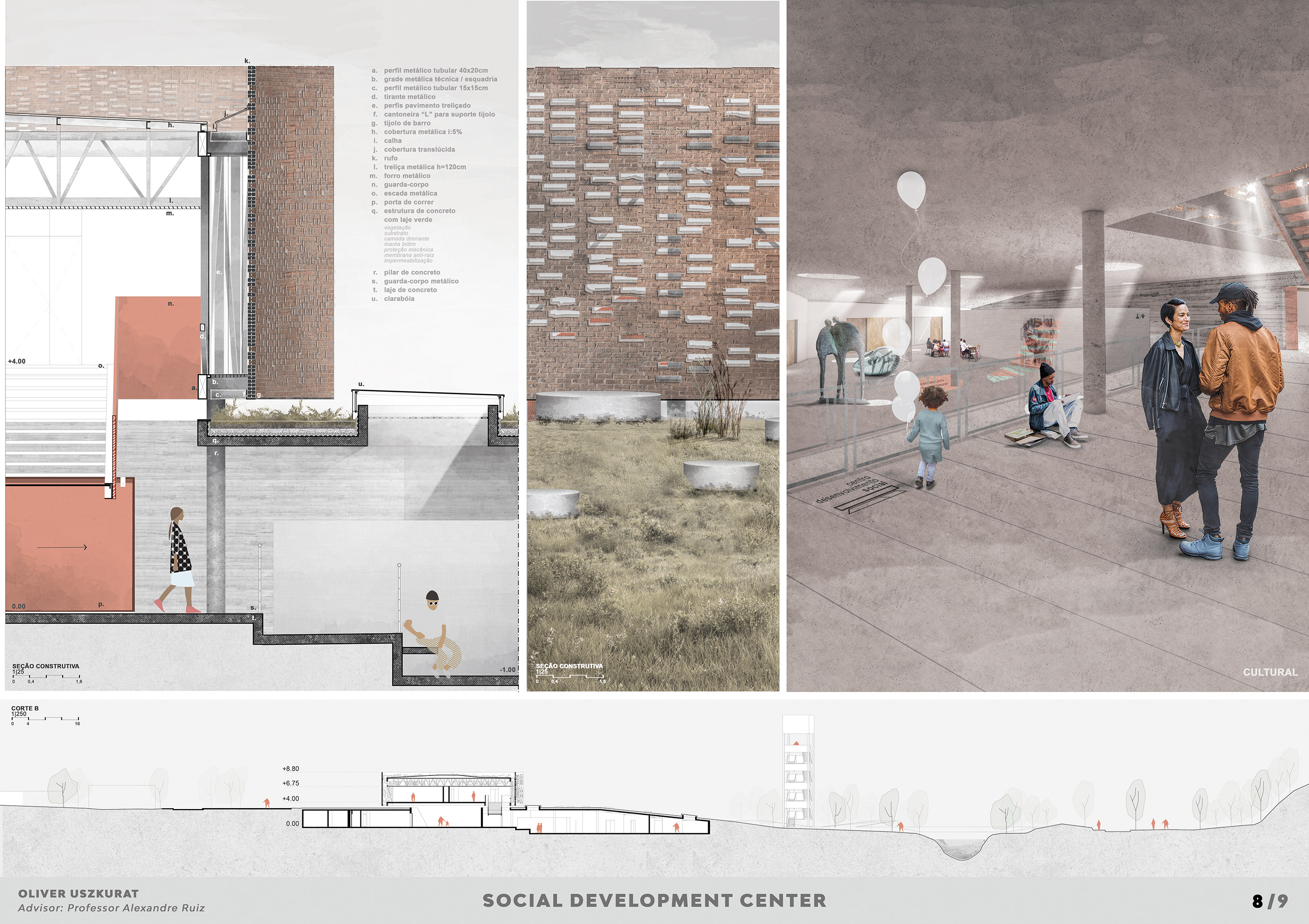
Strategic color usage can establish a visual hierarchy within your sheets. Highlight critical elements with bold and contrasting colors to draw attention. This helps viewers navigate the sheet effectively. This deliberate use of color draws the eye to key components, such as focal points, important details, or crucial design elements. It ensures that viewers can readily identify and comprehend the most significant aspects of your architectural presentation, enhancing their overall understanding and engagement. In essence, color becomes an invaluable ally in conveying your design intent and making your architectural sheets more accessible and impactful.
3. Material Representation:
Architectural design often involves various materials. Proper color selection can help depict these materials accurately. For example, when portraying wood, opting for warm, rich browns can authentically convey the texture and warmth of this material. On the other hand, when representing concrete, choosing cool, subdued grays can aptly capture its industrial and sleek characteristics.
4. Cultural Significance:
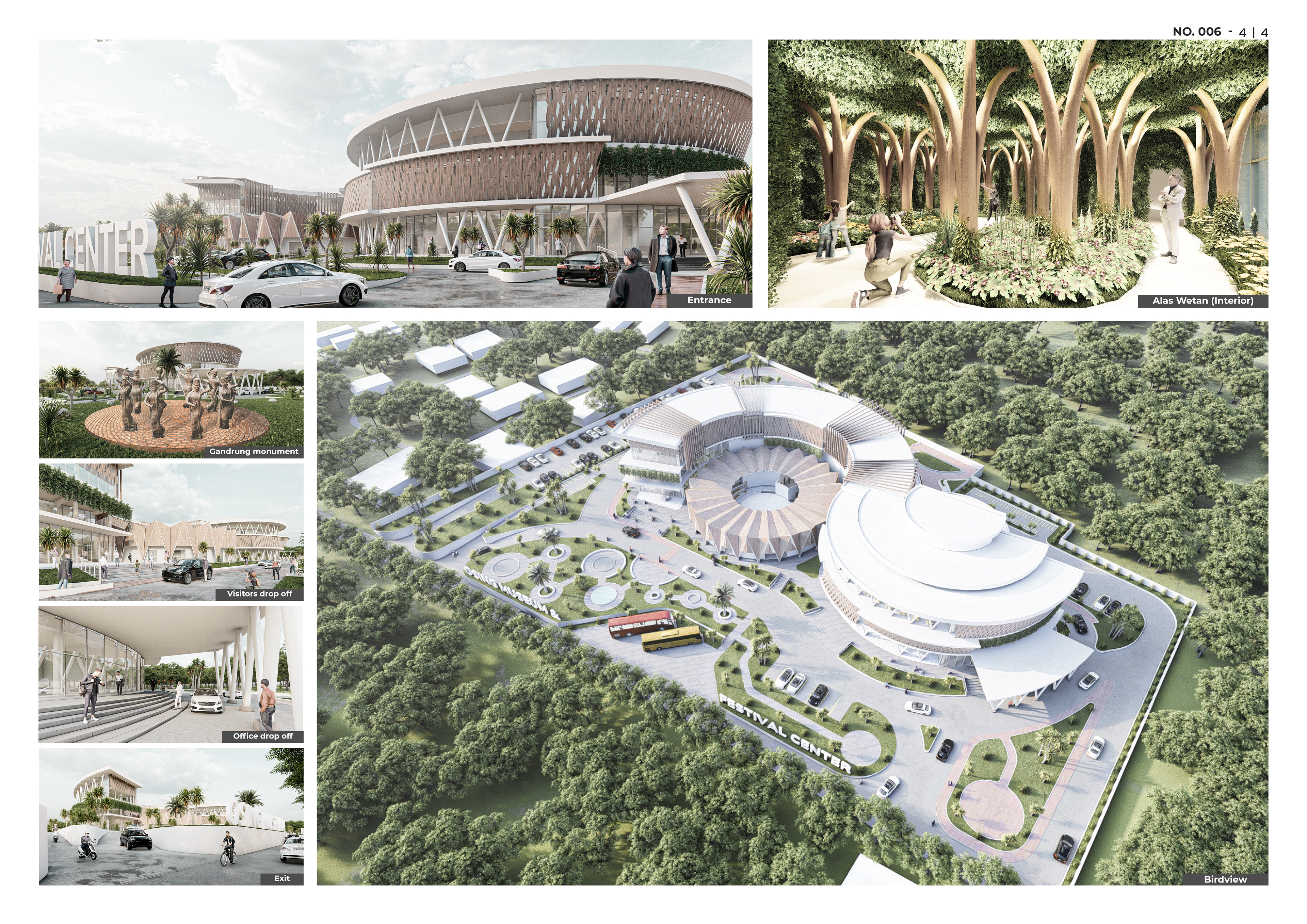
Colors can have cultural and contextual significance. In some cultures, certain colors are associated with specific meanings or traditions. Be mindful of these associations when choosing colors for international projects. For instance, while a particular color might evoke positive emotions or signify something auspicious in one culture, it could have entirely different connotations or even be considered inauspicious in another. Being aware of these cultural associations ensures that your color choices respect local customs and values, fostering a harmonious relationship between your design and its environment.
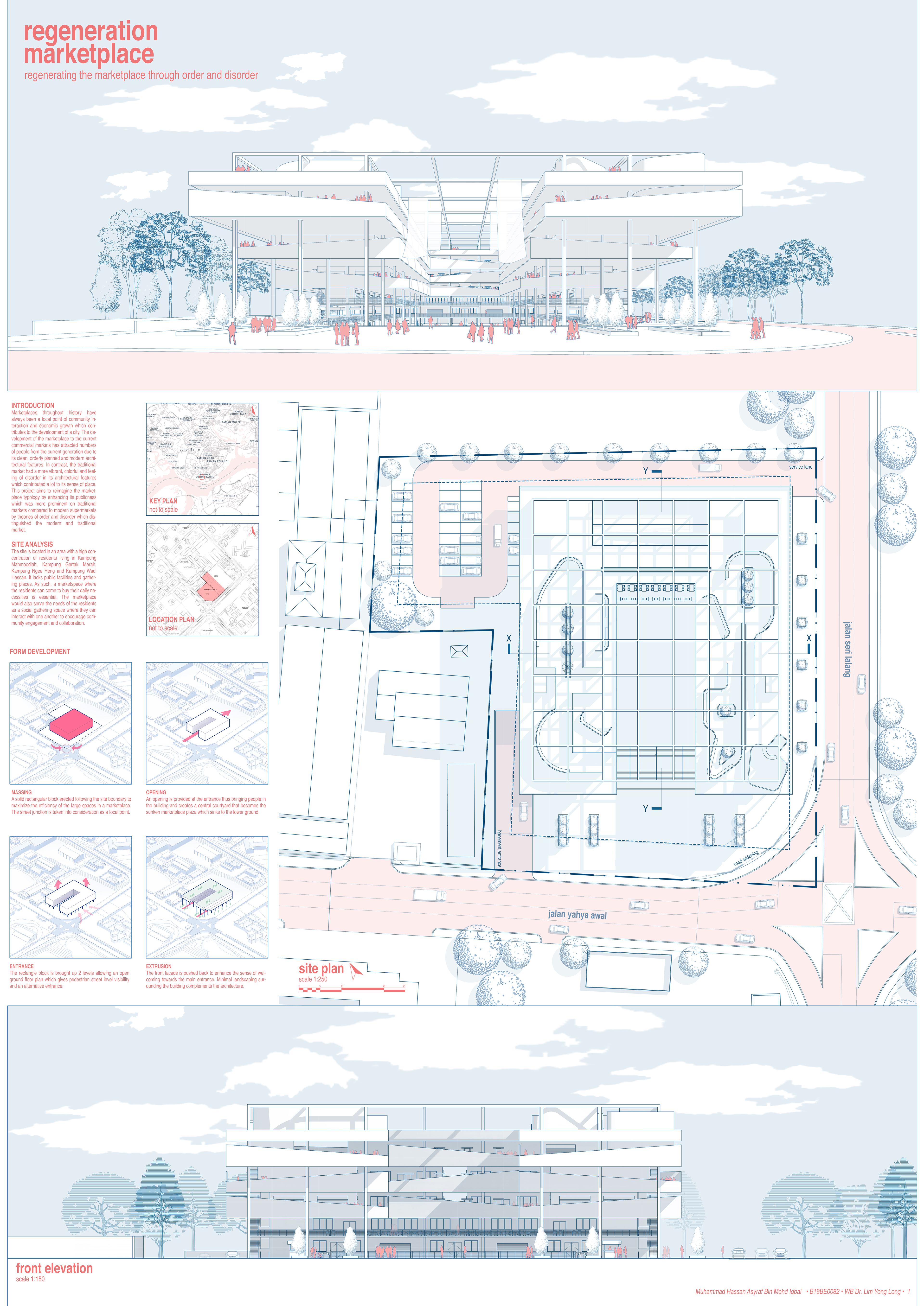
5. Clarity and Readability:
While color is powerful, it should not compromise clarity and readability. Ensure that your color choices enhance rather than hinder the understanding of your design. Incorporate colors judiciously, making certain that they amplify the visual hierarchy, highlight critical information, and create a cohesive narrative within your architectural sheets. The aim is to strike a delicate balance where colors enrich the presentation, making it more engaging and immersive, while still allowing viewers to easily grasp the essence of your design.
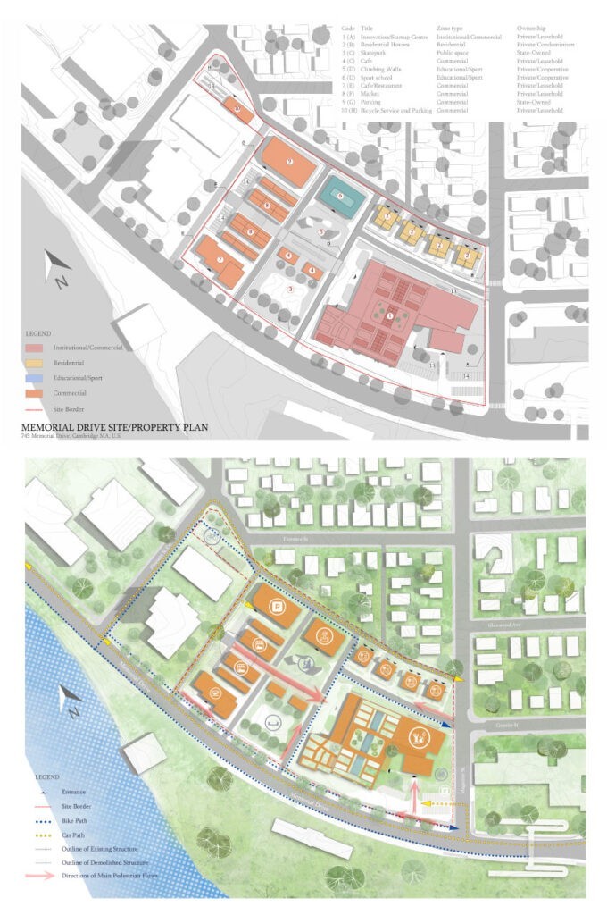
Techniques for Mastering Architectural Sheet Composition
1. Prioritize Clarity
The foremost principle of architectural sheet composition is clarity. Your sheets should communicate your design ideas clearly and effectively. Use concise labels, annotations, and a consistent visual language to avoid any confusion.
2. Establish Hierarchy
Create a clear hierarchy on your sheets to guide the viewer’s eye. Use larger fonts and bolder lines for essential information and smaller, subtler elements for secondary details. This hierarchy ensures that viewers absorb the most critical information first.
3. Balance and Alignment
Achieving balance and alignment in your sheets is essential for visual harmony. Distribute content evenly across the sheet, avoiding clutter. Ensure that your drawings and text are aligned properly for a professional and organized look.
4. Use Color Strategically
Color can be a powerful tool in architectural sheet composition. Use it to differentiate between various elements or to highlight critical details. However, exercise caution and maintain a cohesive color palette that complements the project’s overall aesthetic.
5. Embrace Technology
In the digital age, leveraging architectural software can greatly enhance your sheet composition. Software tools like AutoCAD, Revit, and Adobe Creative Suite offer powerful features for creating and organizing your architectural sheets efficiently.

Common Mistakes to Avoid
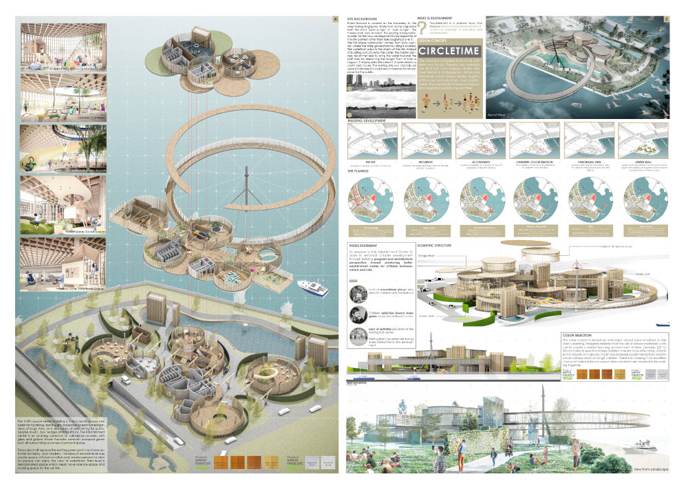
While striving for excellence in architectural sheet composition, it’s crucial to be aware of common mistakes that can undermine your efforts:
- Overcrowding: Crowded sheets can overwhelm viewers. Avoid the temptation to include every detail on a single page; instead, use multiple sheets to maintain clarity.
- Inconsistent Styling: Maintaining a consistent style throughout your sheets is vital. Inconsistencies can lead to confusion and a lack of professionalism.
- Poor Labeling: Unclear labels or missing annotations can leave viewers puzzled. Ensure all elements are appropriately labeled and annotated.
- Neglecting the Client Perspective: Remember that not all viewers are architects. Your sheets should be understandable to clients, contractors, and other stakeholders with varying levels of technical expertise.
Conclusion:
Mastering the art of architectural sheet composition is a skill that can set you apart in the competitive world of architecture and design. By understanding the basics, employing effective techniques, and avoiding common pitfalls, you can create sheets that not only convey your design intent but also leave a lasting impression on your audience.
Remember, architectural sheet composition is not just a technical requirement; it’s a form of storytelling. It’s how you bring your architectural vision to life on paper. So, embrace the challenge, refine your skills, and let your sheets speak eloquently for your designs.

Urban Design Lab
About the Author
This is the admin account of Urban Design Lab. This account publishes articles written by team members, contributions from guest writers, and other occasional submissions. Please feel free to contact us if you have any questions or comments.
Related articles


Remembering Frank O. Gehry: The Architect Who Redrew Skylines

Architecture Professional Degree Delisting: Explained
Periodic Table for Urban Design and Planning Elements


History of Urban Planning in India
UDL GIS
Masterclass
GIS Made Easy – Learn to Map, Analyse, and Transform Urban Futures
Session Dates
4th-8th May 2026
Free E-Book
From thesis to Portfolio
A Guide to Convert Academic Work into a Professional Portfolio”

Urban Design Lab
Be the part of our Network
Stay updated on workshops, design tools, and calls for collaboration
Recent Posts
- Article Posted:
- Article Posted:
- Article Posted:
- Article Posted:
- Article Posted:
- Article Posted:
- Article Posted:
- Article Posted:
Sign up for our Newsletter
“Let’s explore the new avenues of Urban environment together “


